
Emerging Blue
Objective
When Scott Gibree founded Emerging Blue, he envisioned more than a typical staffing agency. He set out to create a new kind of creative placement firm, one that prioritizes meaningful, high-touch relationships with both clients and talent. His goal was to redefine how brands connect with creative professionals by offering unparalleled attention, empathy, and insight. With a brand rooted in passion (especially for the color blue), Emerging Blue needed a visual identity that would stand out while reflecting its unique positioning.
Scope
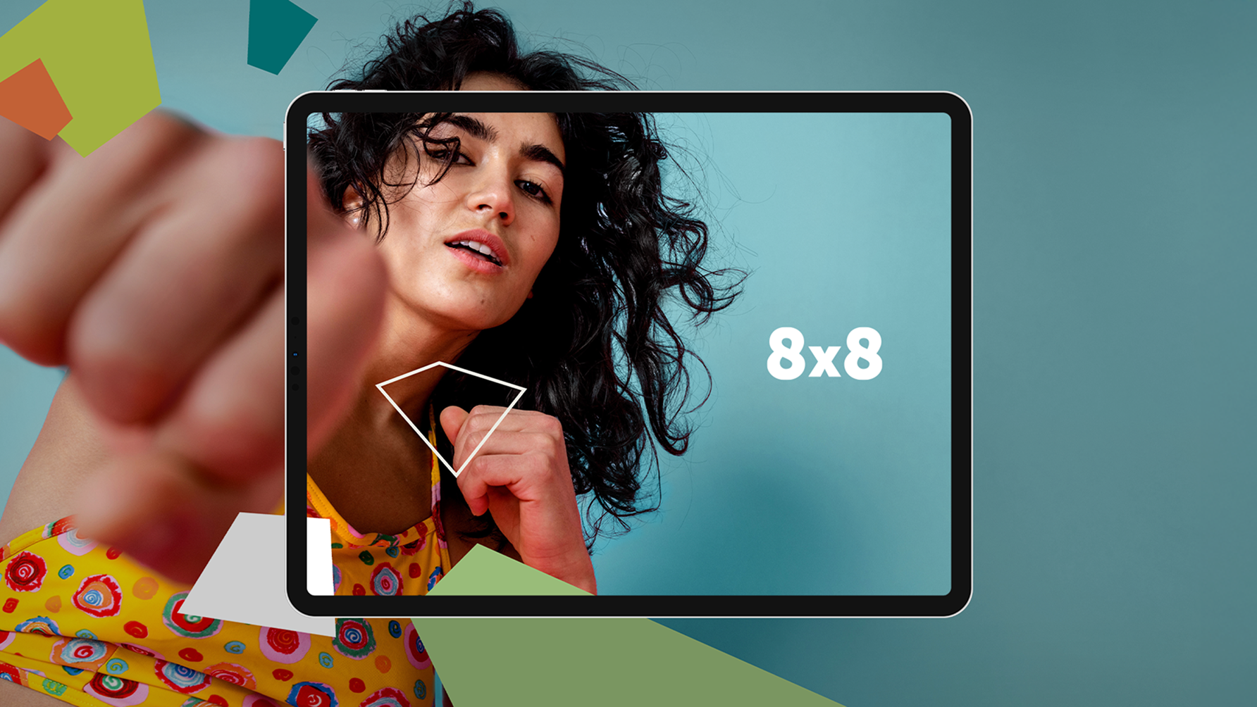
Brand Identity
Print Collateral
Interior Consulting
The Solution
Barretto-Co. always strives to buck current design trends in favor of creating design solutions that have staying power.
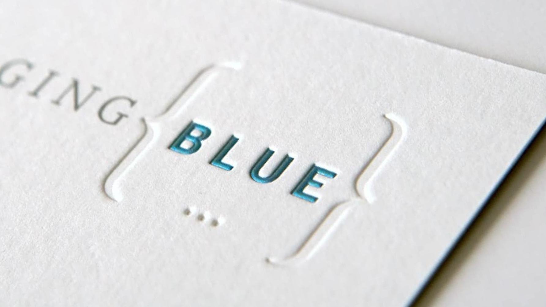
Barretto-Co. Partnered with Emerging Blue to introduce the brand to the world with a visual identity as distinct as its mission. Our logotype solution combined a refined serif with a clean sans serif, blending classic elegance with modern clarity. This duality helped appeal to the wide range of brands and creatives EB aims to serve. True to our philosophy, we steered clear of fleeting design trends and focused on creating a brand system with longevity and substance. The result was timeless, confident, and versatile—much like the talent Emerging Blue represents.
Scott’s deep love for the color blue infused the entire process. Though we hadn’t previously shared his enthusiasm (having leaned more Apple than IBM), his passion quickly became contagious. What began as a branding project grew into a shared appreciation for the emotional and visual impact of blue.
Impact
At Barretto-Co., we design for what lasts. And sometimes, what lasts is blue.
The final identity gave Emerging Blue a distinct and lasting presence in the creative staffing space, communicating trust, individuality, and high design standards from the very first impression.
The Exploration


The Work