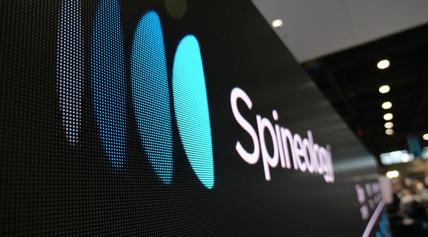

Spineology
Objective
Spineology, an innovator in the lumbar fusion industry, had developed OptiMesh—a unique, clinically validated product with the potential to transform spinal surgery. Despite its groundbreaking technology, Spineology struggled with outdated perceptions and lacked a clear, compelling narrative to reclaim its rightful position as a category leader.
The company needed a complete overhaul of its brand identity and messaging to modernize its public image, communicate its differentiation, and drive market adoption among surgeons, healthcare systems, and investors.
Scope
Stakeholder Discovery & Competitive Research
Visual Identity & Logo Redesign
Messaging Framework Development
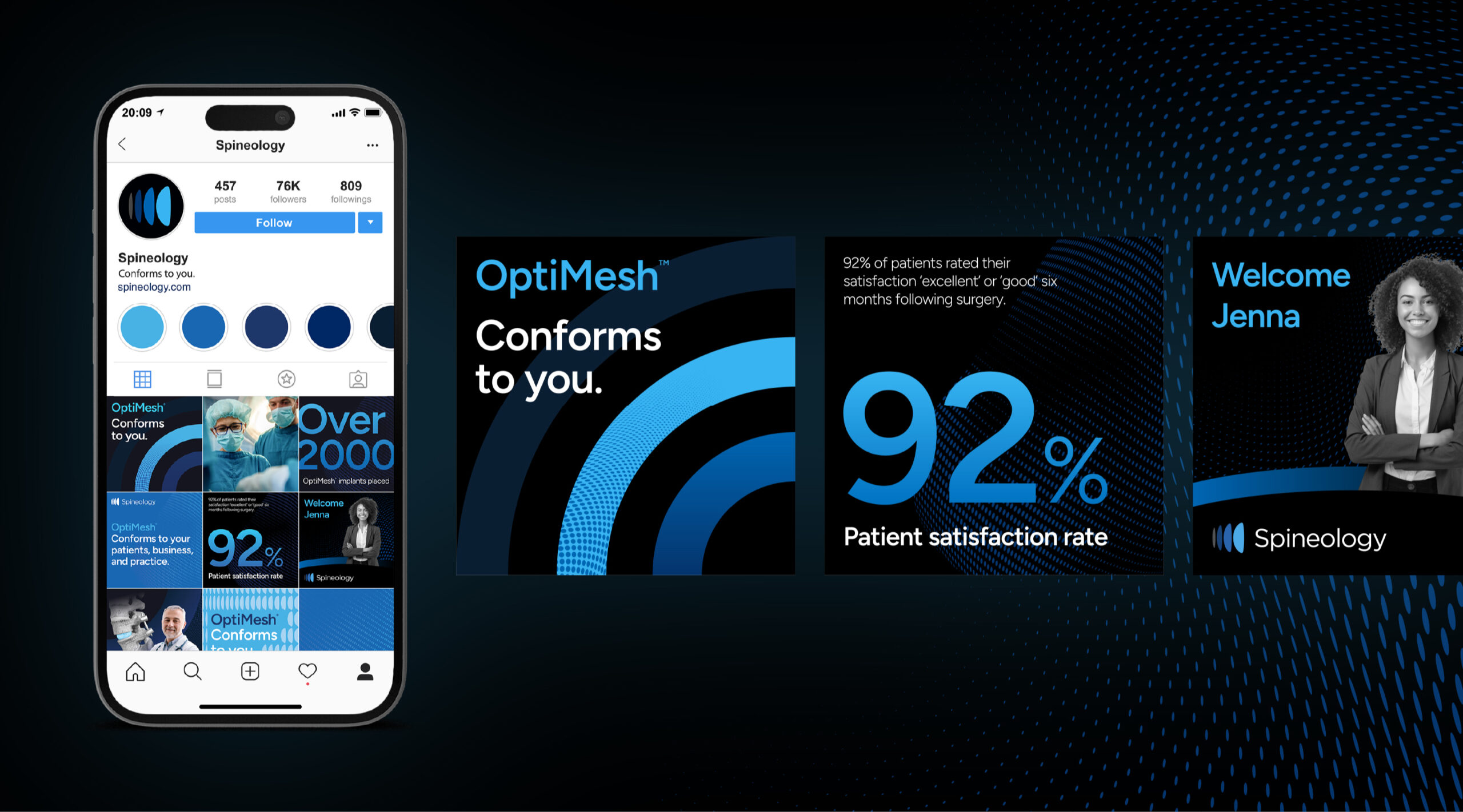
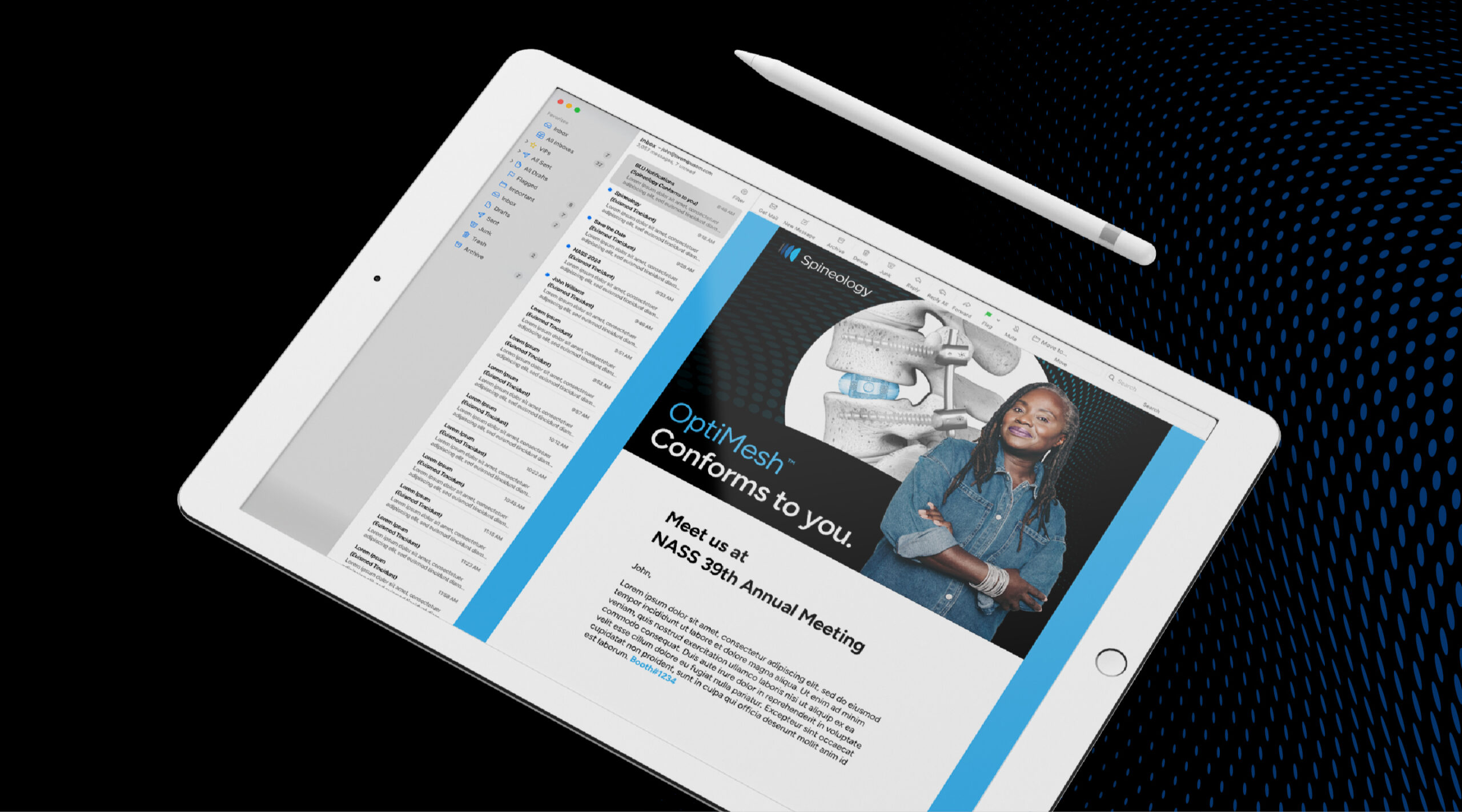
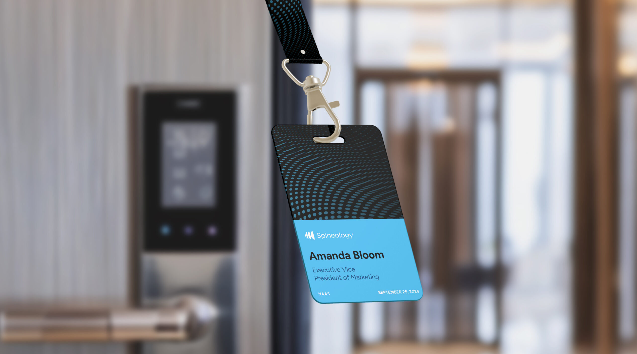
Brand Toolkit & Marketing Templates
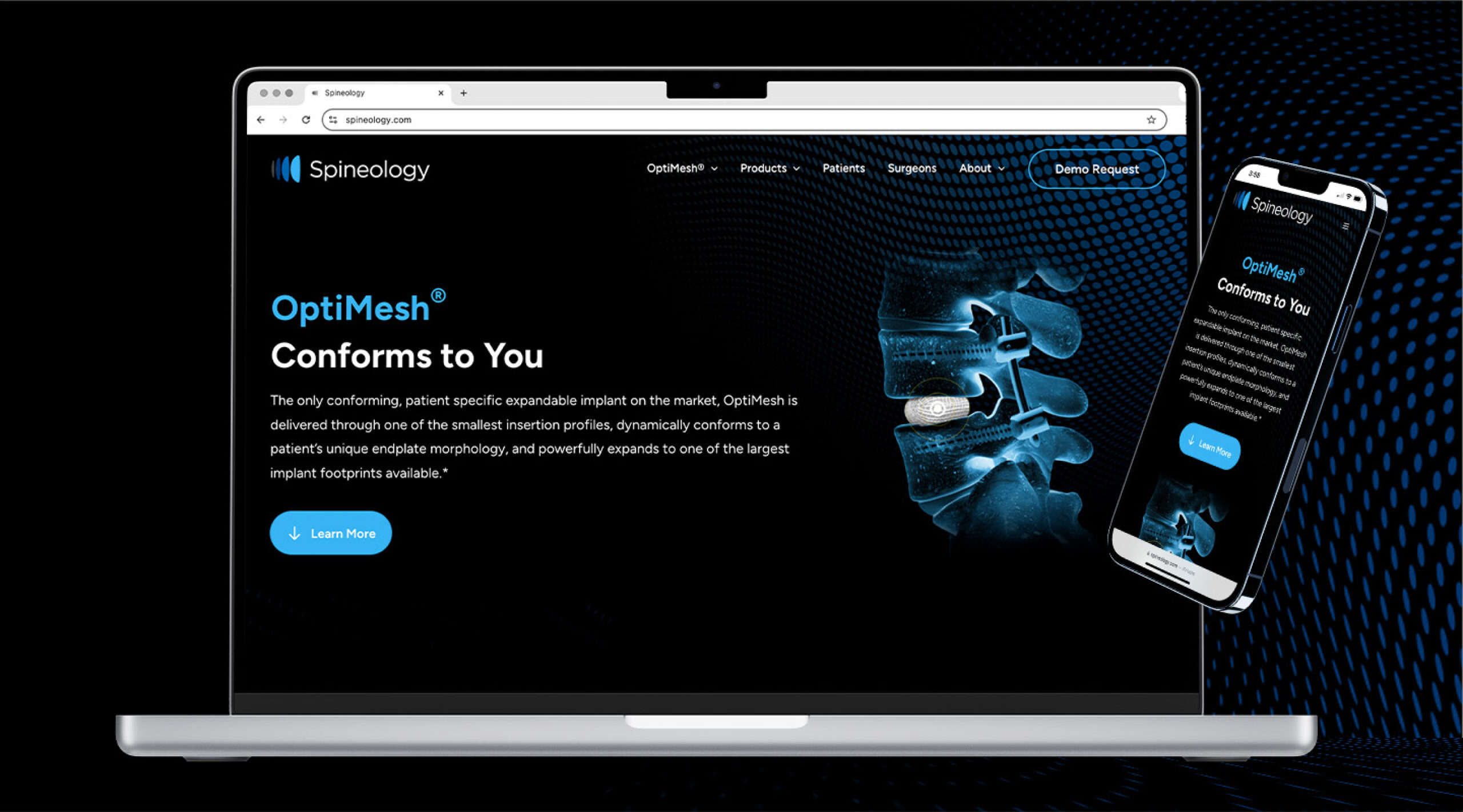
Website Style Guide & Visual System
The Solution
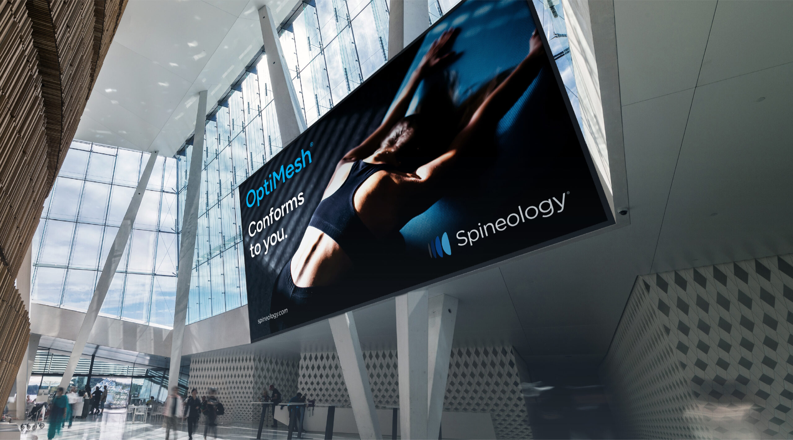
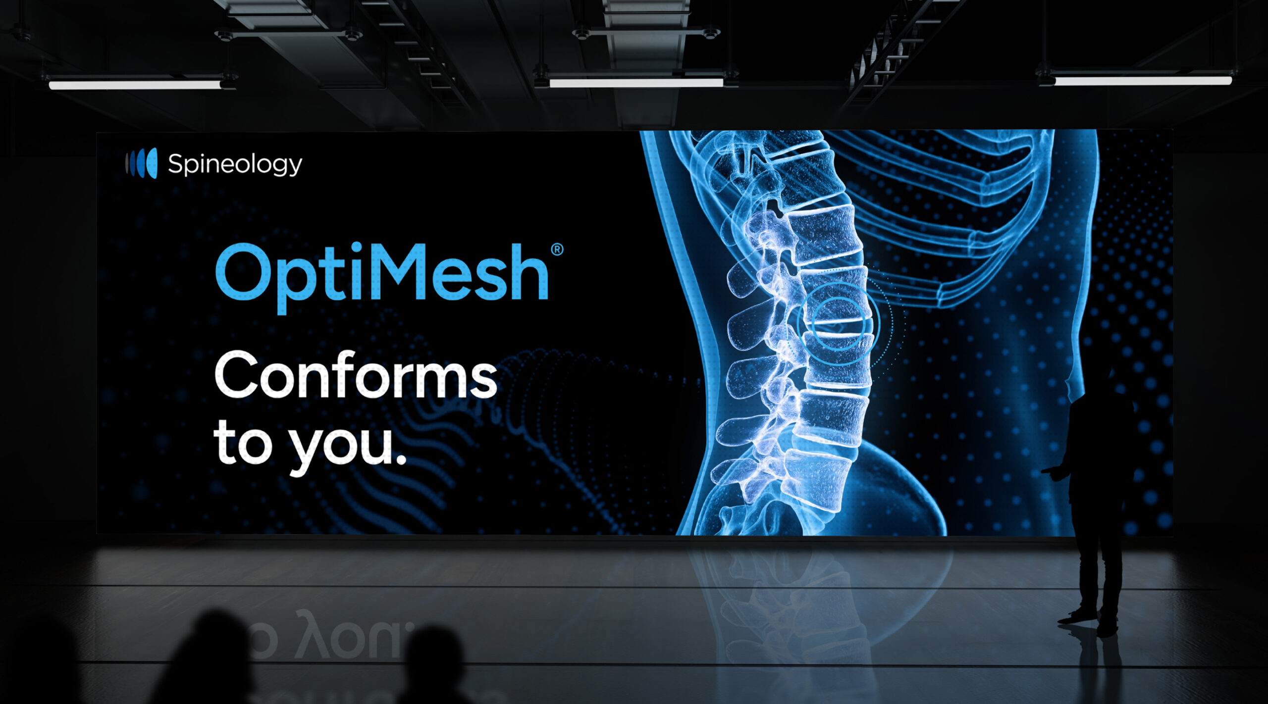
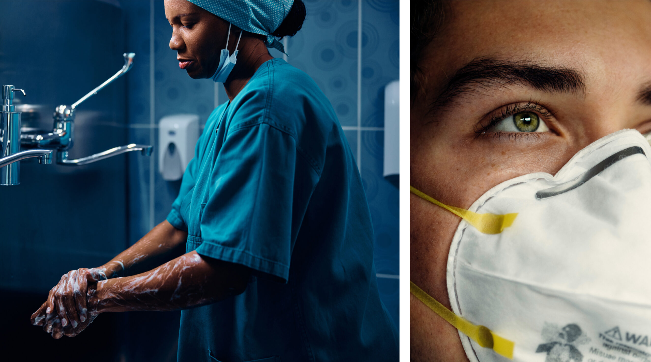
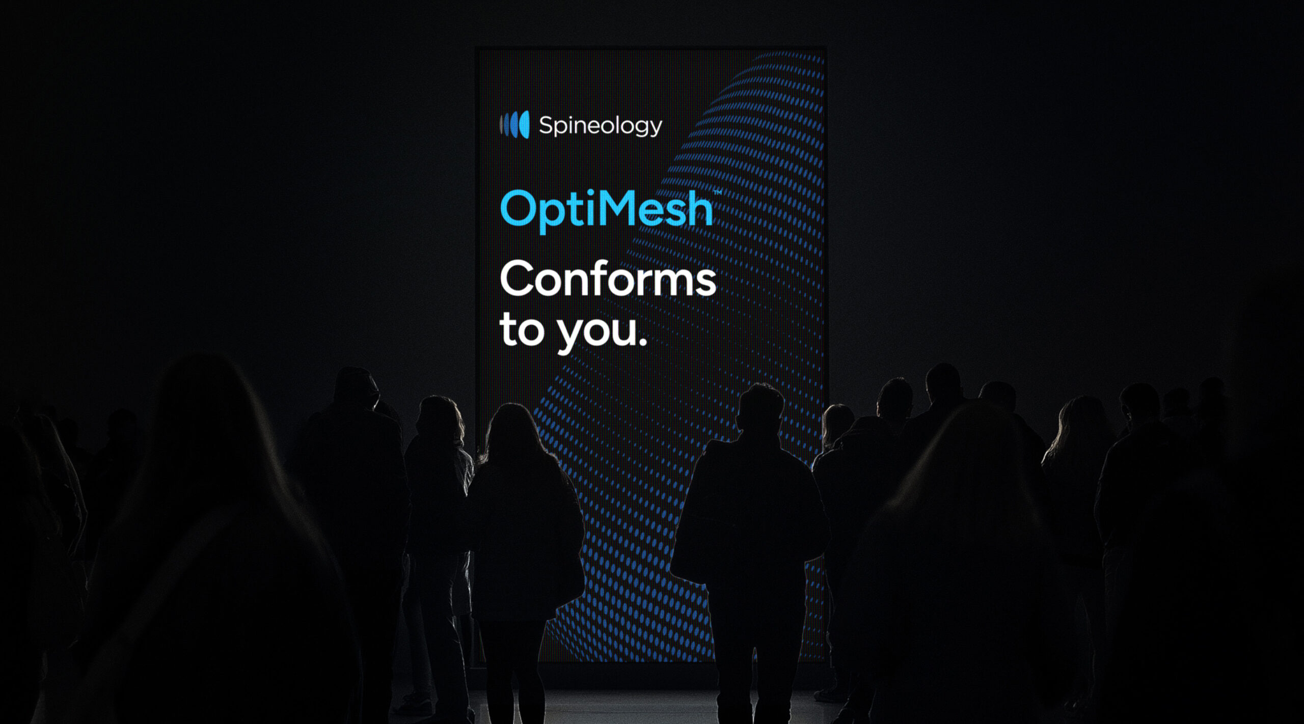
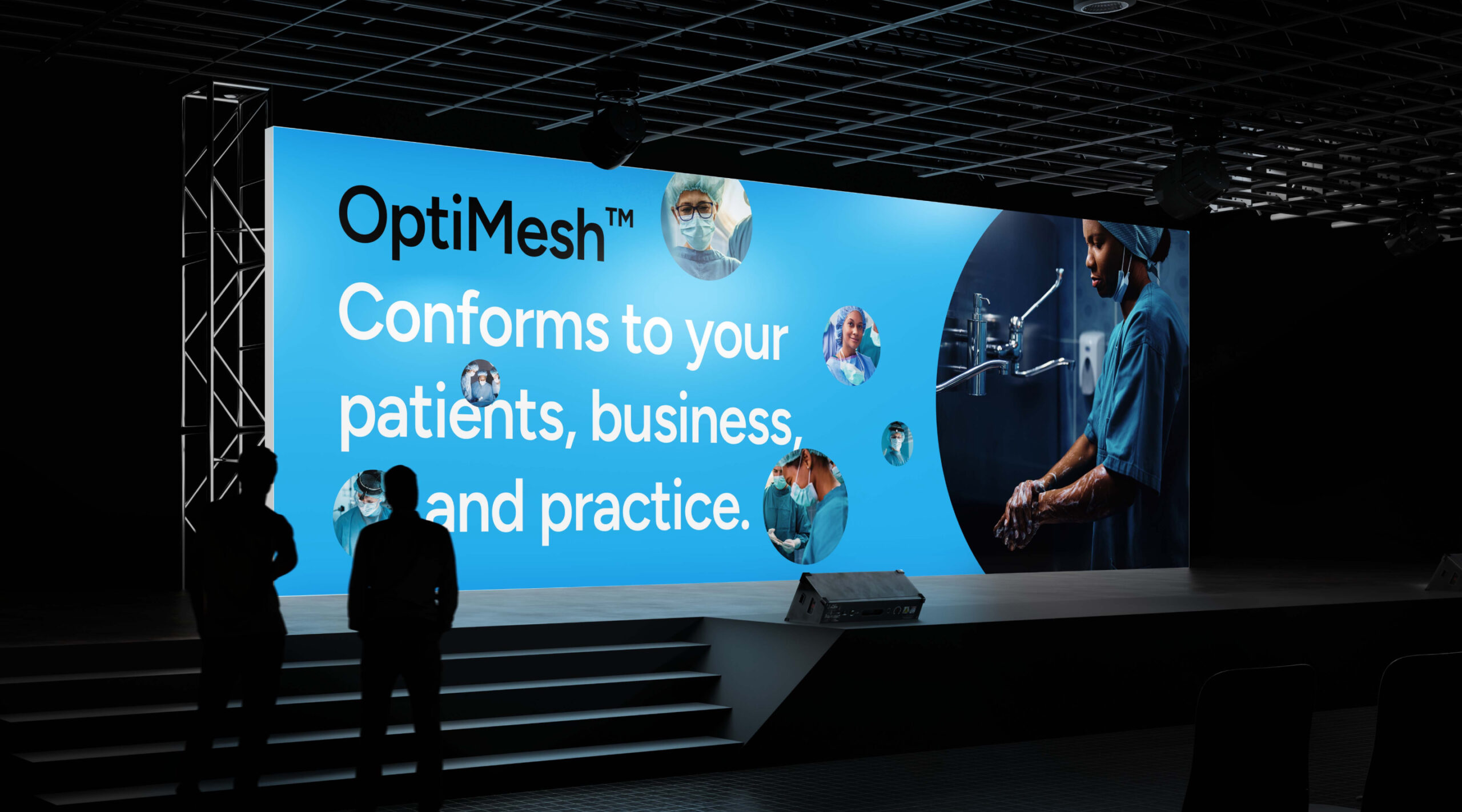
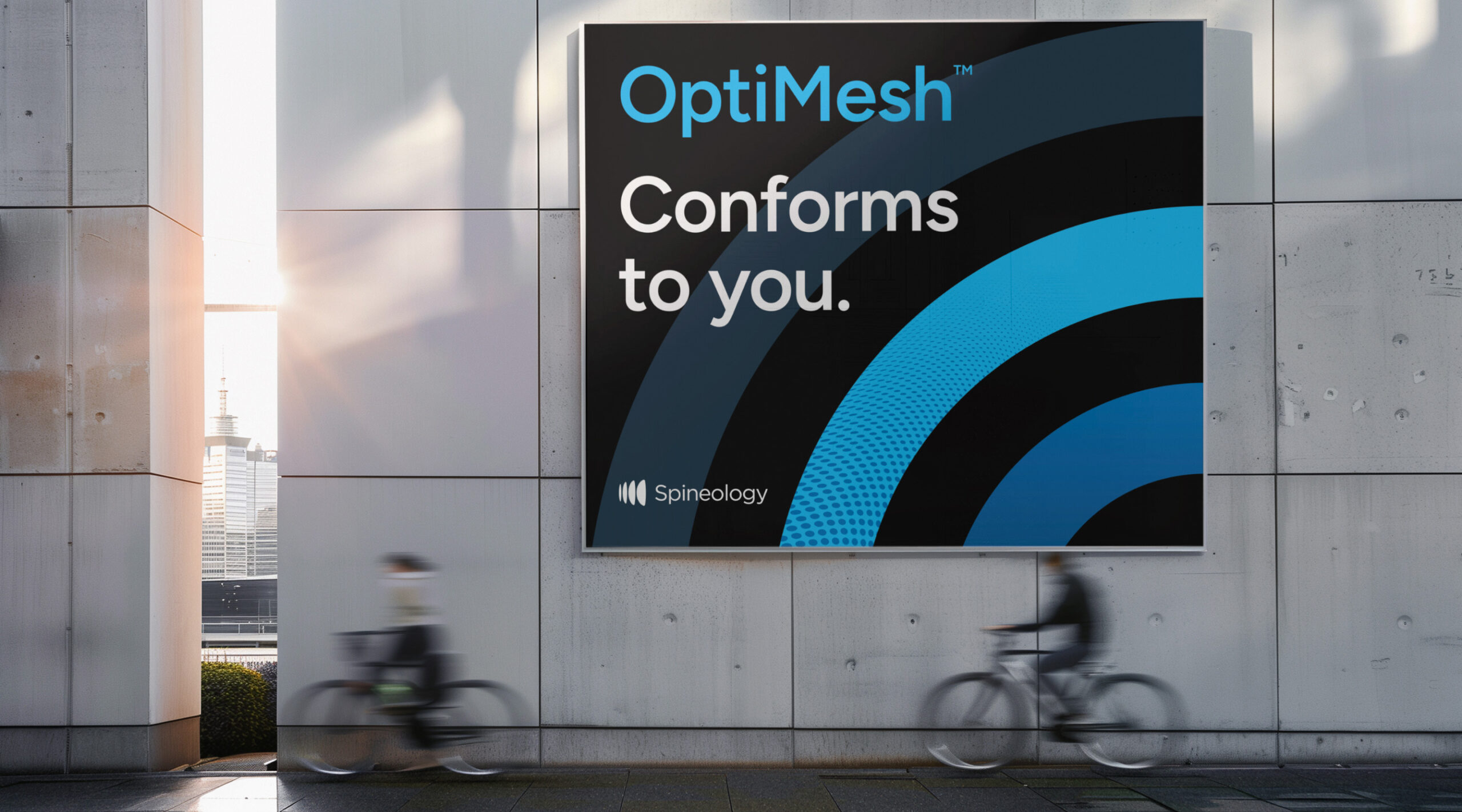
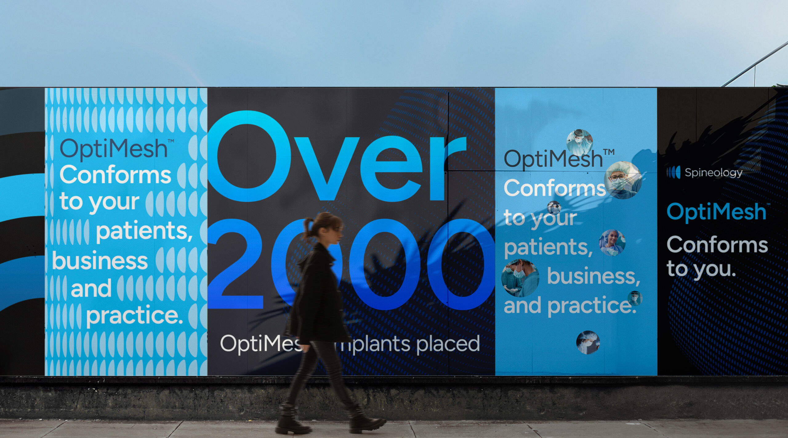
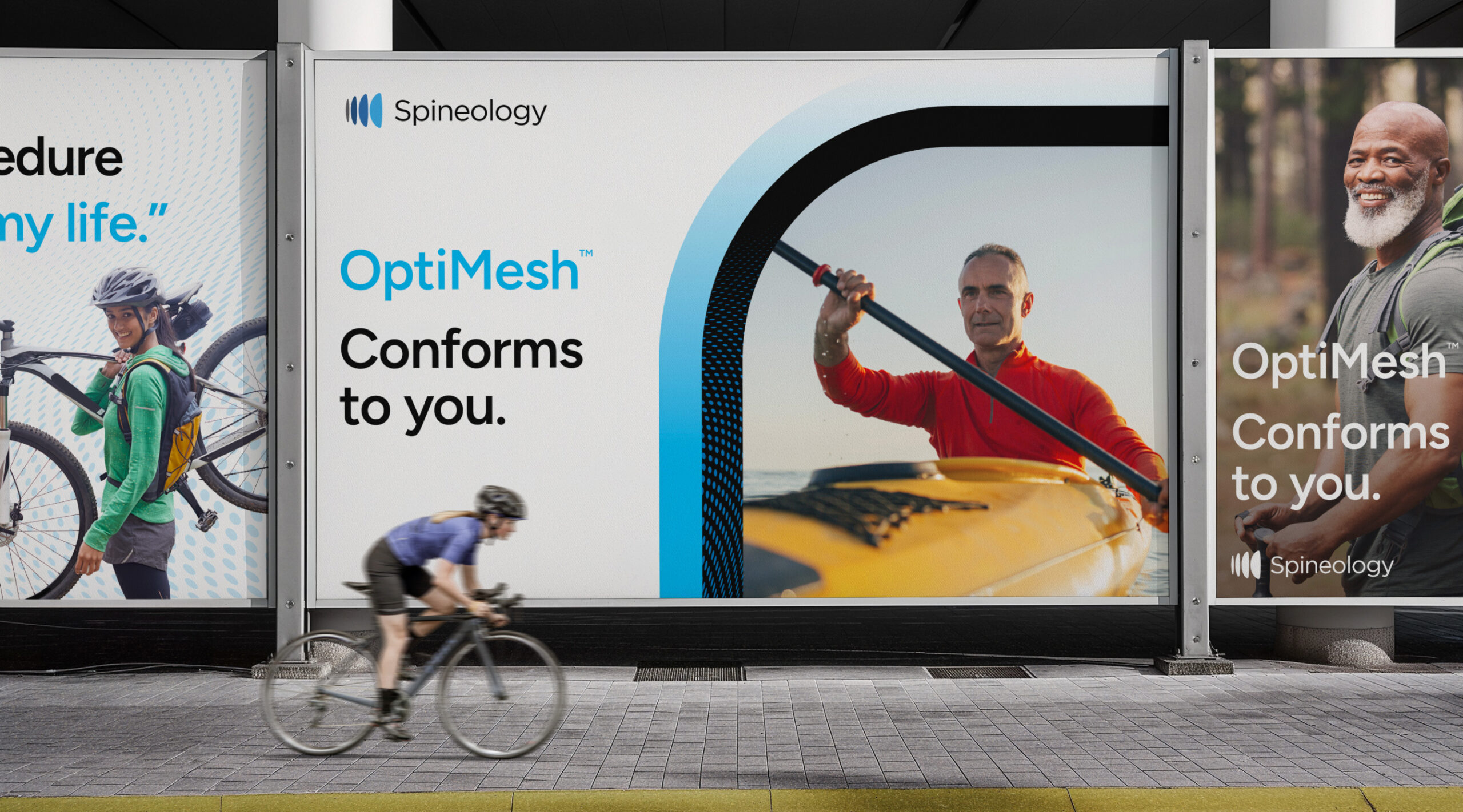
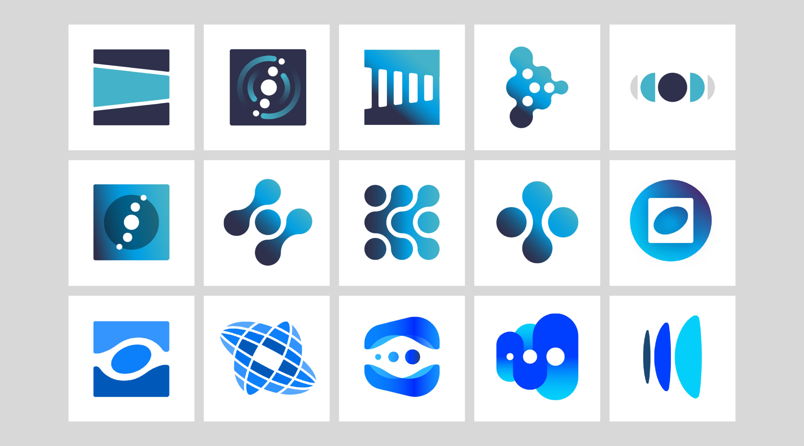
We developed a bold, modern visual identity for Spineology, emphasizing precision, innovation, and patient-centered outcomes.
Barretto-Co. partnered with Spineology to immerse deeply in the lumbar fusion space, conducting stakeholder interviews, competitor research, and market landscape analysis. We identified the key opportunity: position OptiMesh not just as a product but as the centerpiece of a disruptive shift in spinal care.
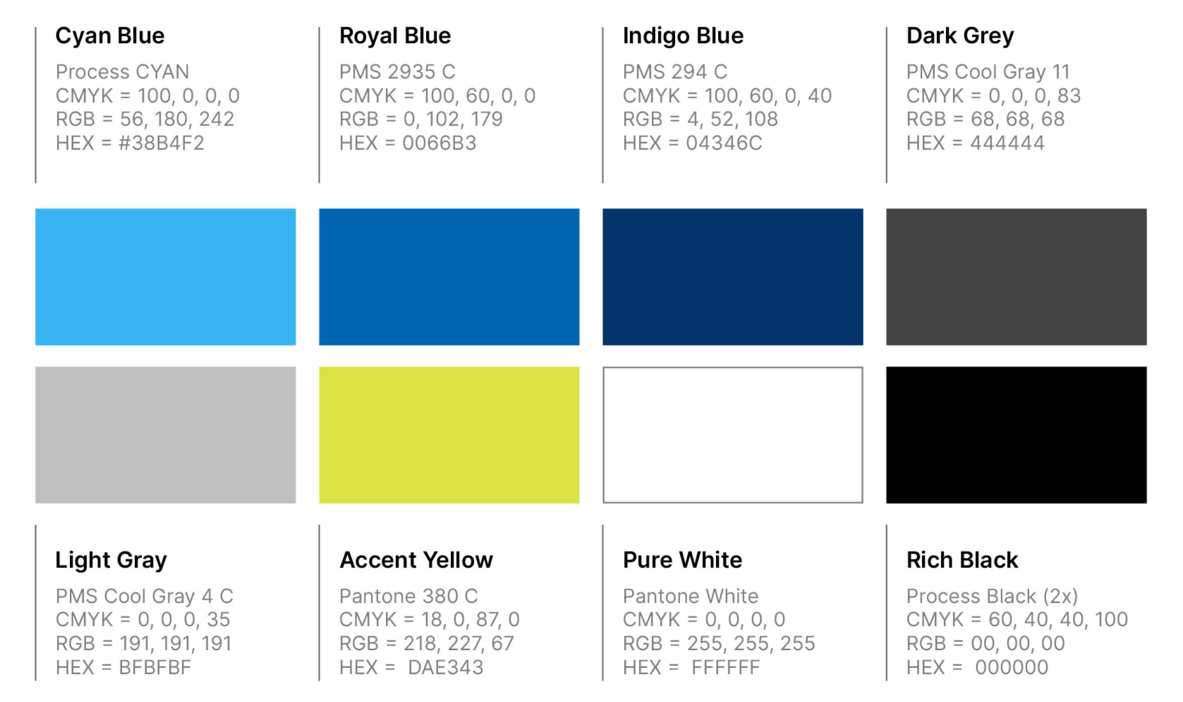
This included a new logo, a refined color palette, and typography designed to convey technical expertise while remaining accessible to diverse audiences.
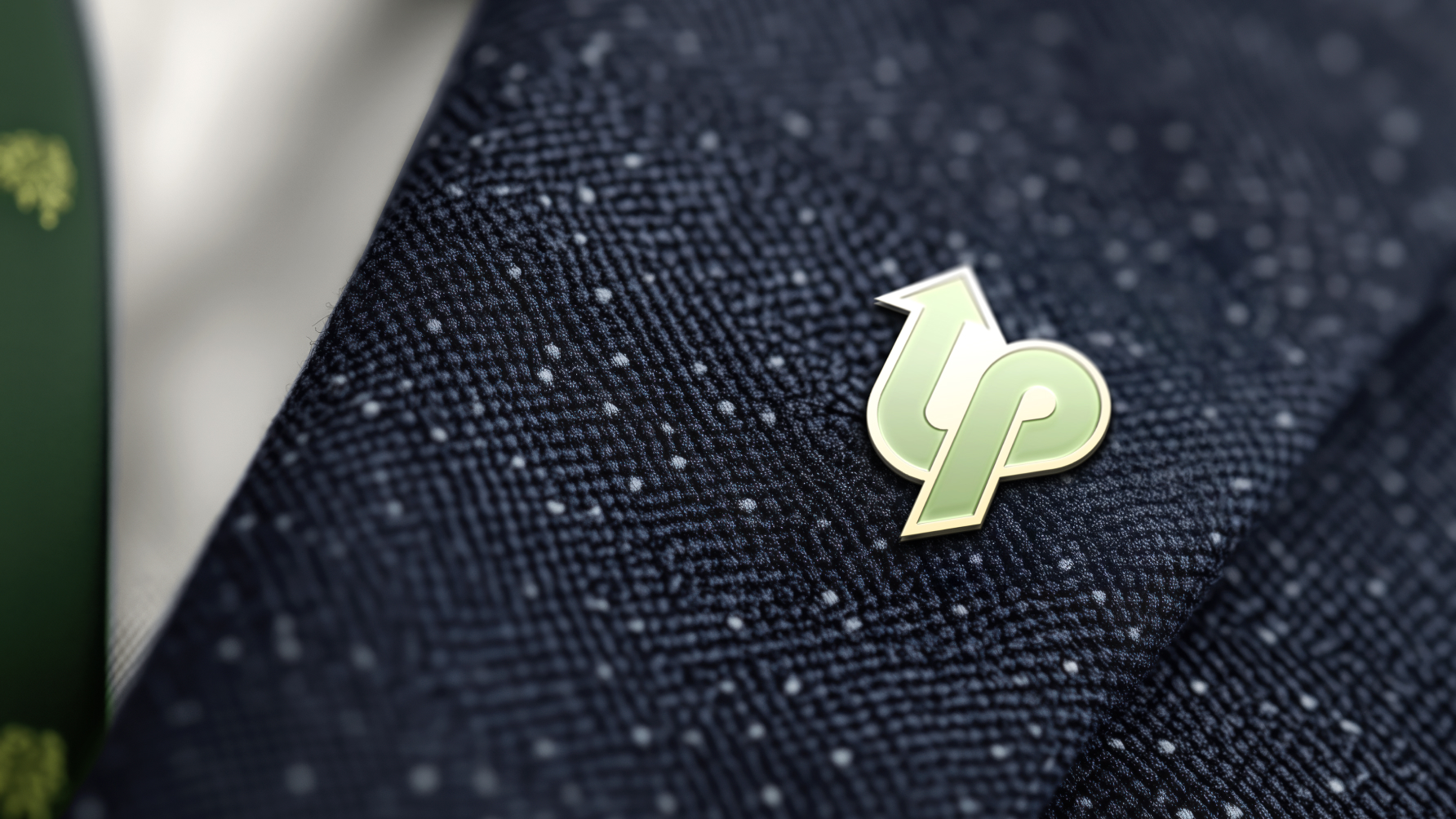
Our team created a comprehensive brand toolkit, updated marketing communications templates, and a website style guide to ensure consistency across digital, print, and event channels. Messaging frameworks were crafted to clearly articulate Spineology’s value proposition and the unique clinical advantages of OptiMesh.
Impact
Barretto-Co. transformed Spineology’s complex product narrative into a bold, clear, and modern brand—ready to lead and redefine its category in healthcare innovation.
The rebrand positioned Spineology to confidently re-enter the conversation as a category disruptor in spinal fusion, empowering sales teams, educating surgeons, and attracting new partnerships and interest across the medtech space.
The Exploration
Color Palette
The Work