The North Face
Objective
Barretto-Co. Typically focuses on comprehensive branding and digital initiatives, not one-off print jobs. But when the opportunity arose to collaborate with The North Face, we made an exception. As a globally respected outdoor brand, The North Face’s commitment to innovation and purpose made this a natural fit for our creative agency.
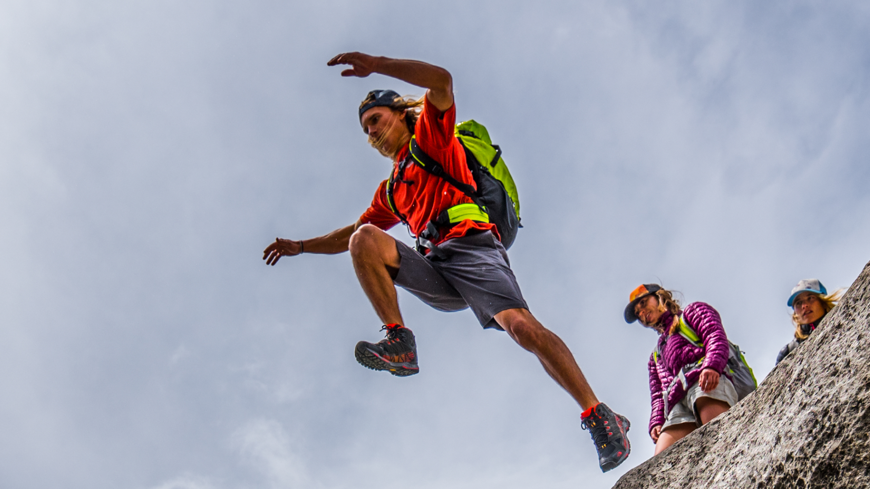
The project involved producing a high-impact print communications piece that needed to reflect the breadth of The North Face brand. Organized around four distinct markets: Urban Exploration, Mountain Culture, Mountain Sports, and Mountain Athletics, the brand required a design solution that was versatile, clear, and aligned with its identity.
Scope
Naming Strategy
Visual Design
Print Production
Print Project Management
The Solution
In partnership with agency collaborator Farinella, Barretto-Co. Led the effort in naming, visual design, production, and print management.
Our creative services focused on developing a polished, cohesive piece that spoke to both lifestyle and performance audiences.
The printed collateral captured the brand’s core market segments while reinforcing its bold, purpose-driven identity. From strategic naming to meticulous production oversight, our role ensured that every detail aligned with The North Face’s high standards and adventurous spirit.
Impact
The final result was a sophisticated print asset that elevated internal brand communications and reflected the premium nature of The North Face.


