
Au Bon Repas
Objective
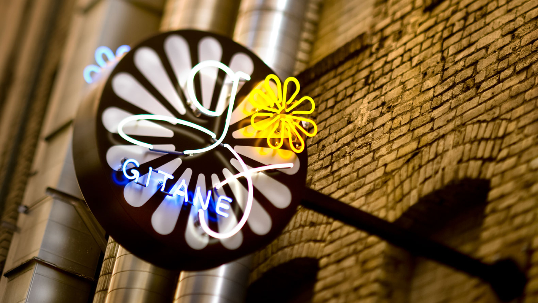
Franck LeClerc, a visionary restaurateur in San Francisco, set out to launch what would become one of the city’s most romantic dining experiences. As part of a growing collective of eateries under the banner of Au Bon Repas, he needed a unified brand identity that captured the elevated yet approachable spirit of each establishment—beginning with the now-iconic Gitane, nestled in downtown SF.
The challenge was to create a brand system that honored the sophistication of fine dining while embracing the charm of neighborhood hospitality—an identity flexible enough to scale across multiple concepts.
Scope
Naming & Concept Development
Brand Identity Design
Print & Digital Collateral
Website Design
Environmental & Experience Consulting
The Solution
Au Bon Repas is an independent collection of San Francisco restaurants in and around Claude Lane delivering memorable dining experiences.
Barretto-Co. partnered with LeClerc and interior design expert Charles Doell to craft a holistic brand experience, beginning with naming strategy and identity design for Café Claude, Gitane, and Gaspar restaurants in what was known as the “French Quarter” in downtown San Francisco.
We designed elegant brand identities for each property in the collective, ensuring consistency while allowing each restaurant’s unique character to shine. Our scope extended from logos and menus to print materials, signage, email marketing, and websites. The visual system used refined typography, rich color palettes, and bespoke iconography to evoke mood and memory.
The branding complemented the immersive interiors, creating seamless experiences from first impression to final course. The result was a timeless visual identity that resonated with both longtime locals and new patrons.
Impact
Au Bon Repas established itself as more than a collection of restaurants—it became a culinary brand with a cohesive vision.
Our work helped elevate the group’s profile, attract design-conscious diners, and lay the foundation for future growth in the Bay Area hospitality scene.