
Autodesk
Objective
In the early 2000s, Autodesk—a global leader in 3D design software—found itself at a pivotal transition. After a major acquisition and internal restructuring, the company needed a fresh creative approach to unify its marketing communications. With the internal team being rebuilt, Autodesk sought a trusted agency partner to help carry the brand through this critical moment.
Scope
Brand Identity & Guidelines
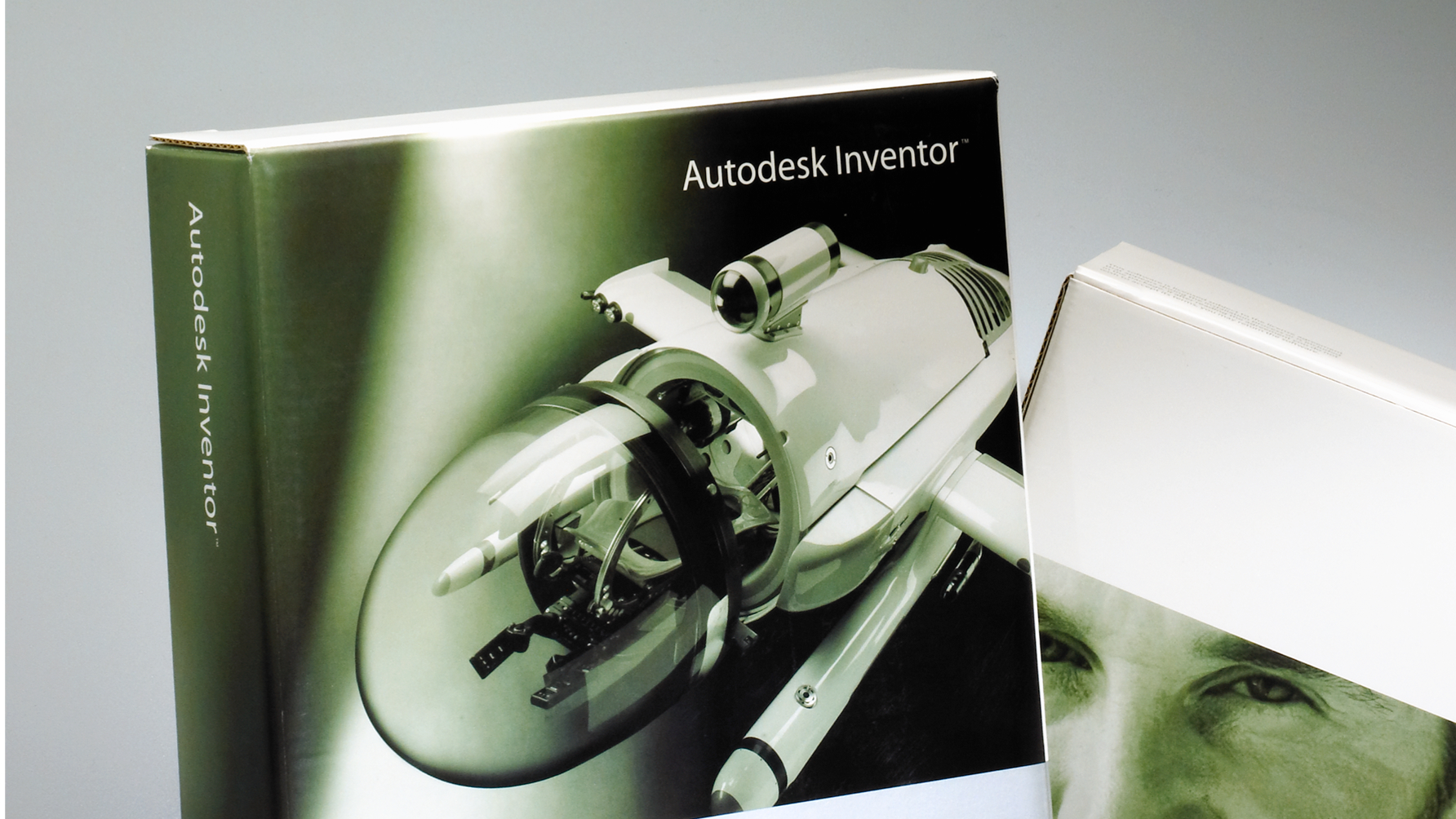
Product Packaging
Marketing Collateral
Department Sub-Branding
Event & Environmental Graphics
Website Design & Support
The Solution
Barretto-Co. was selected as the design agency of record for Autodesk from 2000–2002.
We were tasked with elevating Autodesk’s creative across all touchpoints while the internal team was in flux. The scope was wide-ranging and fast-paced, including everything from product brochures and marketing collateral to department sub-branding, event graphics, digital assets, and web support.
One standout project came just before the December holidays: following a key acquisition in the entertainment sector, CEO Carol Bartz wanted to unveil a new Autodesk brand identity upon returning from break. Our team responded with urgency, creativity, and clarity—delivering high-fidelity design explorations that ultimately shaped the next chapter of Autodesk’s public image.
We collaborated closely with internal creative leads, including Cameron Woo and John Seminerio, to ensure alignment with Autodesk’s evolving vision. Our identity system and collateral design introduced structure, energy, and modernity to a brand ready to enter the 21st century.
Impact
In moments of transformation, Barretto-Co. delivers brand leadership that’s both strategic and execution-ready.
Barretto-Co.’s partnership helped re-establish Autodesk’s creative foundation during significant change. While the company has since evolved its brand, our work contributed to a crucial era, building continuity, clarity, and confidence in a time of transition.

Identity System

Collateral System


Packaging