
San Francisco Health Service System
Objective
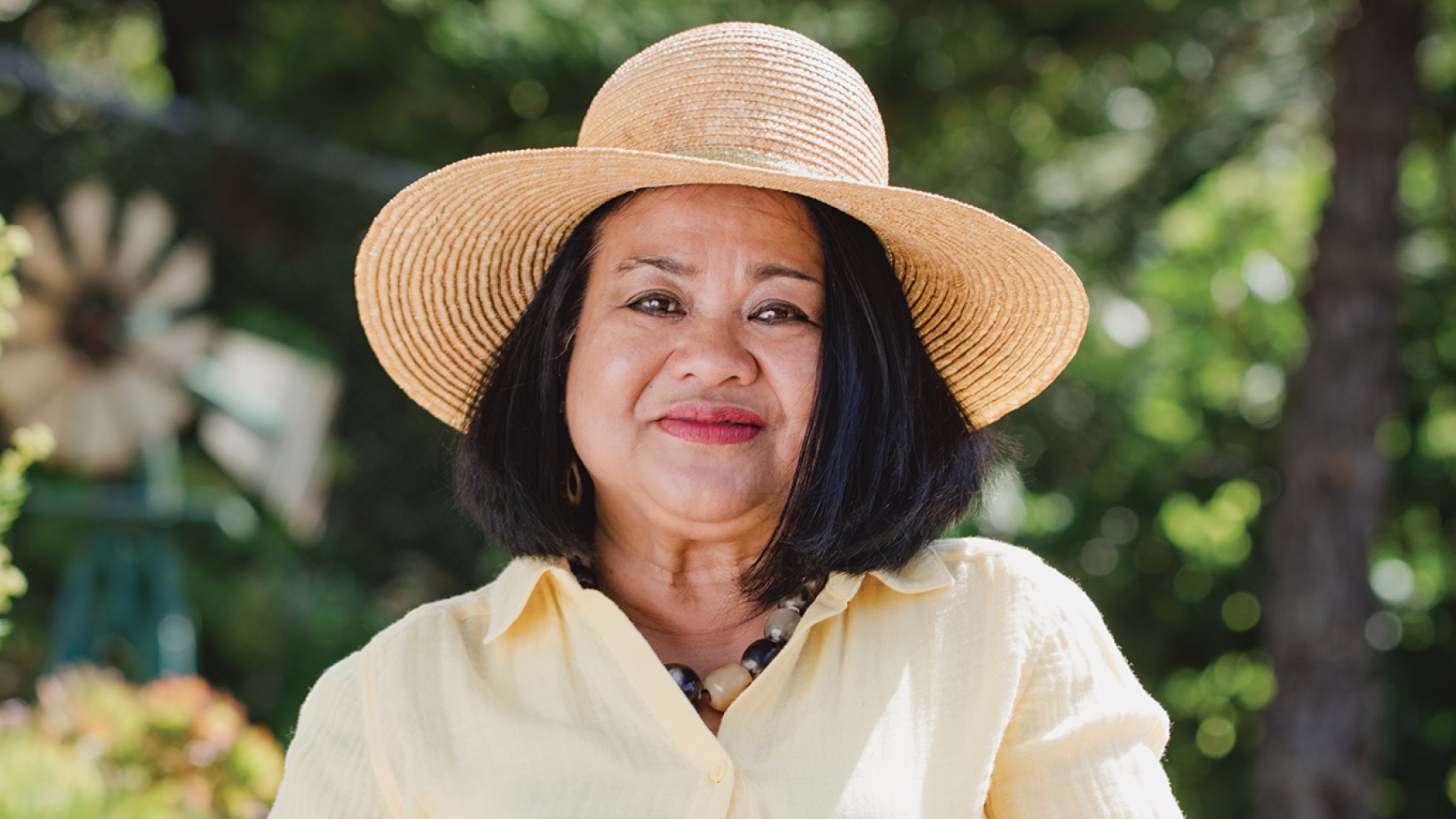
The San Francisco Health Service System (SFHSS) serves a diverse member base, including employees and retirees of the City & County of San Francisco, the San Francisco Unified School District, City College, and the San Francisco Superior Court. In 2016, SFHSS launched the Well-Being initiative to promote healthier lifestyles, but needed a cohesive identity and campaign to unify their message, increase engagement, and communicate effectively across their broad audience.
The goal was ambitious: create a compelling, clear, and accessible platform that encourages healthy behaviors while aligning with the values of public service.
Scope
Brand Identity & Messaging
Visual Toolkit & Templates
Print & Video Campaign Assets
Web Content Design
The Solution
The San Francisco Health Service System is dedicated to preserving and improving sustainable, quality health benefits and enhancing the well-being of employees, retirees, and their families.
Barretto-Co. was brought in to design and launch a brand identity and communications platform for the Well-Being initiative. We began by developing a unifying tagline, mission statement, and brand voice that could resonate across city departments and demographics, from active employees to retirees.
Visually, we built a flexible design framework that included a vibrant color palette, typography, iconography, and campaign templates to be used across digital and print channels. The tone was positive, inclusive, and action-oriented, designed to motivate participation and normalize self-care within the culture of public service.
The campaign extended across a wide range of media: posters, brochures, wellness toolkits, web content, and a video campaign designed to tell real stories and showcase achievable actions. The visual identity system served both the core SFHSS brand and the sub-brand for Well-Being, creating consistency without sacrificing clarity.
Impact
Barretto-Co. helped transform wellness into a movement powered by design and built for people.
The rebrand gave SFHSS the tools to connect more meaningfully with its member population, turning wellness into a shared civic value and strengthening participation across programs.
The Palette


The Work