
ViewRay
Objective
ViewRay, a pioneer in precision radiation therapy, set out to transform its digital identity. The objective was clear: create the most innovative and engaging website in the radiation oncology industry. The company needed a digital platform that would combine high-impact messaging with a seamless user experience, positioning ViewRay as the technology leader in its space.
Scope
Information Architecture
User Experience Design
Website Design & Development
The Solution
We developed a modern, confident interface that reflected ViewRay’s clinical precision and technological leadership.
We began by crafting a digital experience built around clarity, innovation, and trust. Our creative services focused on refining the information architecture and optimizing the user experience to ensure that patients, clinicians, and investors could easily navigate the site and understand ViewRay’s breakthrough technology.
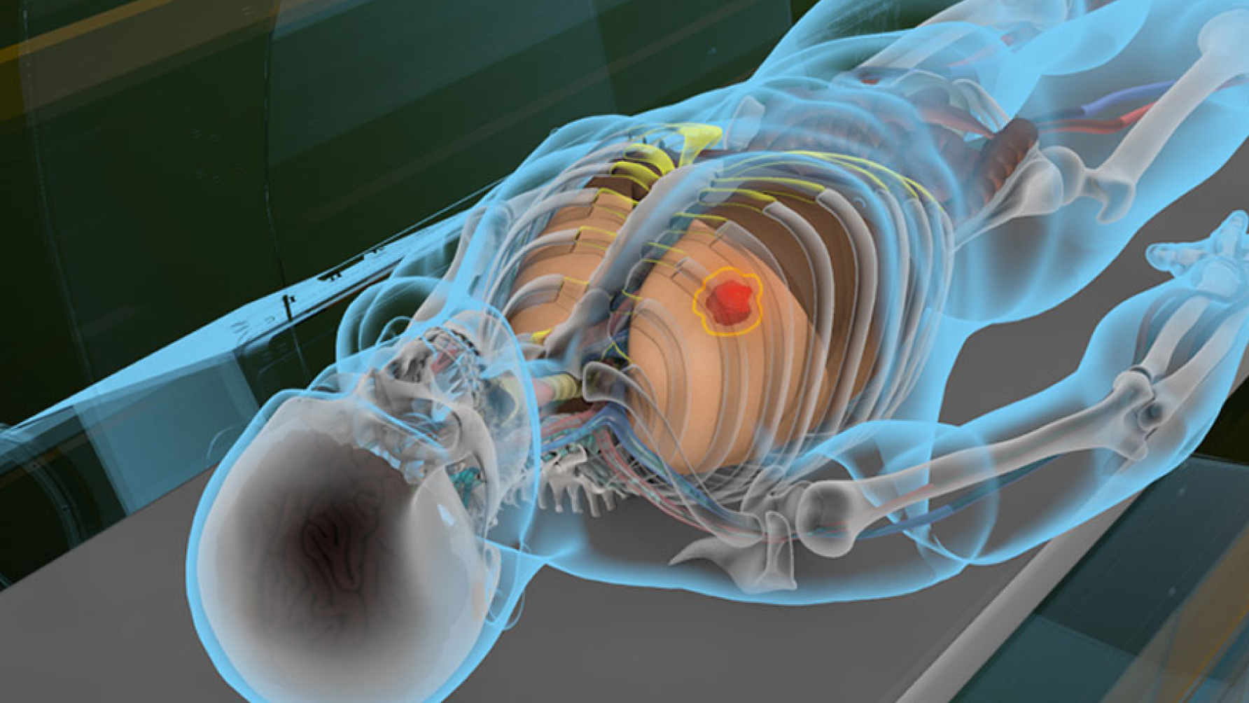
The messaging emphasized ViewRay’s core differentiator: real-time MRI guidance during radiation therapy. “You can’t beat the diseases you can’t see” became a cornerstone of the brand voice, communicating both urgency and innovation in a way that resonated across audiences. The site’s design language balanced minimalism with dynamic storytelling, allowing complex ideas to be communicated clearly and powerfully.
Impact
The redesigned site significantly elevated ViewRay’s digital presence, helping the brand stand out in a highly technical and competitive field.
It strengthened their credibility with medical professionals and investors, supported sales conversations, and contributed to greater visibility within the healthcare technology community.
The Visual Language


The Work