
Avail Medsystems
Objective
Avail Medsystems was pioneering a new category in healthcare: remote collaboration for medical procedures. With a breakthrough platform connecting surgeons, device companies, and clinical experts in real time, Avail had the technology—but needed a brand that could match its ambition, communicate its value clearly, and accelerate adoption in a rapidly evolving space.
Scope
Brand & Go-to-Market Strategy
Visual & Verbal Identity
Website Design & Development
UX Architecture
Launch Campaign Creative
Brand Guidelines
The Solution
Barretto-Co. partnered with Avail to create a bold, modern brand that would resonate with both technical and clinical audiences.
We began by crafting a go-to-market strategy and messaging platform that distilled Avail’s complex offering into a compelling and easily understood narrative.
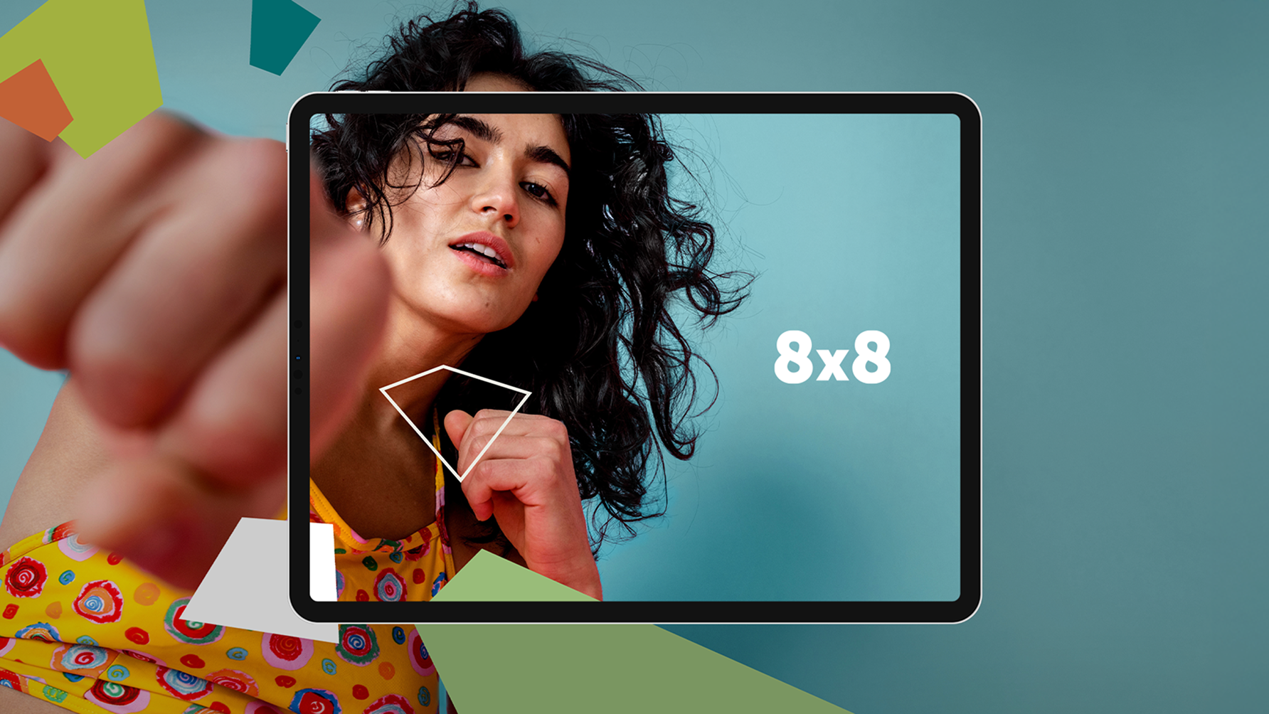
Next, we developed a unified visual and verbal identity—one that conveyed precision, trust, and innovation. The visual system included a custom icon set, streamlined typography, and a vibrant-yet-disciplined color palette that set Avail apart from conventional medtech aesthetics.
We also overhauled the information architecture and user experience of Avail’s website to emphasize clarity, product benefits, and ease of navigation. This included designing a responsive, high-performance digital presence optimized for SEO, lead generation, and storytelling. Our work extended into launch campaigns, print and digital assets, and a complete brand toolkit to guide future marketing efforts.
Impact
Barretto-Co. helped Avail turn a complex technology into a confident brand—one that leads with clarity, credibility, and vision.
The rebrand positioned Avail as the clear leader in a new category of remote medical collaboration. With a differentiated identity and a unified digital experience, the company was able to build credibility with key stakeholders, scale its outreach, and attract both customers and partners worldwide.
Symbols

Color Palette


Typography

Brand System