
Bay Area Brewers Guild
Objective
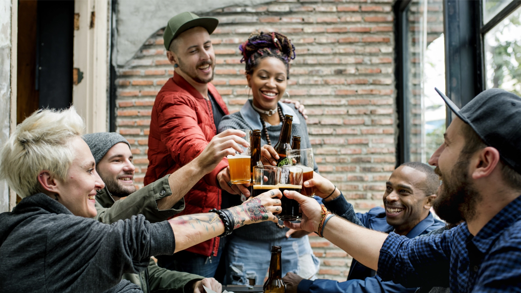
The San Francisco Brewers Guild was evolving—expanding its reach beyond city limits to become the Bay Area Brewers Guild. With this growth came the need for a new regional identity that could unify diverse local chapters while honoring the distinct character of each brewing community. Adding complexity, the Guild also needed a refreshed look for its flagship annual event: SF Beer Week.
The challenge? Build a cohesive brand system that satisfies passionate, opinionated brewers and beer lovers alike—while making a statement that the Bay Area’s craft beer scene is collaborative, creative, and here to stay.
Scope
Regional Brand Identity
Sub-Brand Chapter Logos
SF Beer Week Campaign Design
Event Collateral & Marketing Assets
Stakeholder Alignment Workshops
The Solution
Barretto-Co. kicked off the process with alignment workshops and mood board exercises to guide subjective design conversations.
This helped us navigate creative preferences across a wide array of stakeholders and reach consensus on aesthetic direction.
We created a flexible visual identity system for the regional Guild, including sub-brand designs for each local chapter. The system included bold typography, an earthy-modern color palette, and a modular toolkit that could be adapted across digital, print, merchandise, and event materials.
For SF Beer Week, we designed a thematic campaign that celebrated creativity and community over competition. We developed unified packaging, point-of-sale displays, posters, beer labels, and swag—ensuring that 15+ participating breweries felt part of a larger collective without losing their individual flavor.
Impact
Strong design can bring even the most opinionated communities together around shared values.
The new identity elevated the Guild’s public image and reinforced its mission of collaboration. With design that bridges local pride and regional unity, Barretto-Co. helped the Bay Area Brewers Guild tell a bigger story—one pint at a time.


The Typography

The Palette

The Web