
Let’s talk identity
Brand identity isn’t just about making something look good—it’s about creating a foundation for how people perceive, trust, and engage with your organization.
Over the past 30+ years, Barretto-Co. has been trusted by clients across industries—from global tech firms to local nonprofits—to build brand identities that last.
Unlike trend-driven design that quickly feels dated, our approach emphasizes strategic insight, authenticity, and longevity. Whether it’s launching a startup or reimagining a legacy brand, we deliver systems that hold up—visually, verbally, and emotionally.
We start with listening.
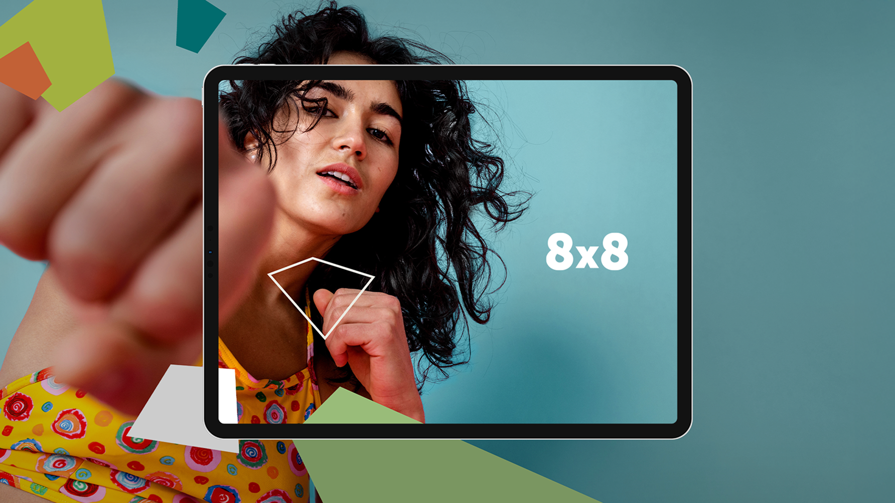
Strong design can bring even the most opinionated communities together around shared values.
Through deep discovery, competitive audits, and collaborative workshops, we help organizations uncover their essence—then express it visually through logos, typography, color palettes, and flexible systems that scale.
We’ve developed brand identities for a wide spectrum of clients, including VeriSign (now Symantec), Autodesk, Bill.com, Sonic, Bay Area Open Space Council, and countless others. From nonprofits advancing economic justice to tech companies shaping the future, our identity work is designed to connect with real audiences and stand the test of time.
Our process blends evidence-based strategy with a designer’s eye for nuance and beauty. Each logo is built with meaning, and every identity system is crafted to function across environments—print, digital, environmental, and motion.
Results
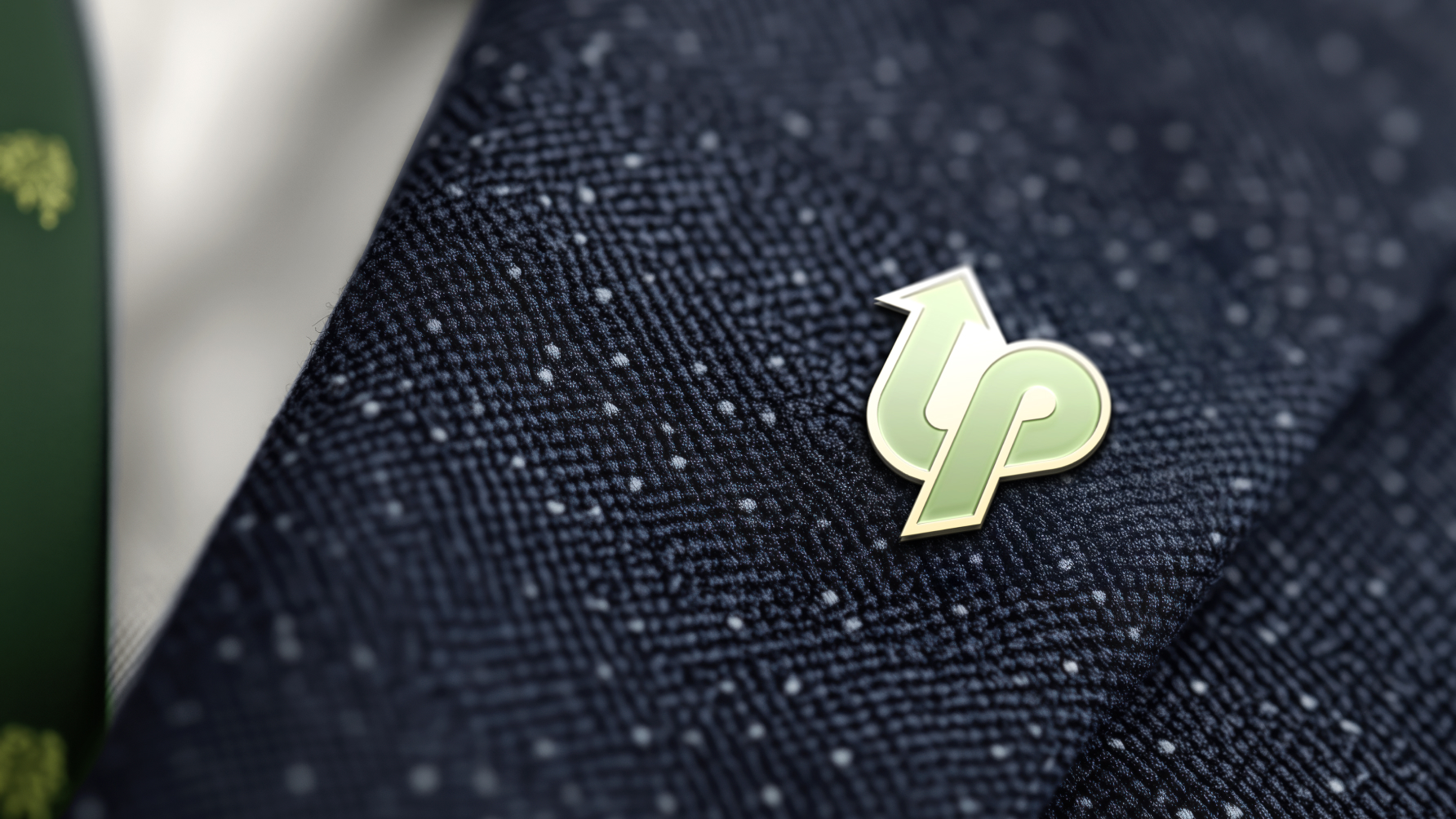
When built with intention, your identity becomes more than a logo—it becomes your legacy.
The true test of a successful brand identity is longevity—and many of ours have remained in use for over a decade. We’re proud that our clients continue to grow with the identities we’ve built together.