
Jingle
Objective
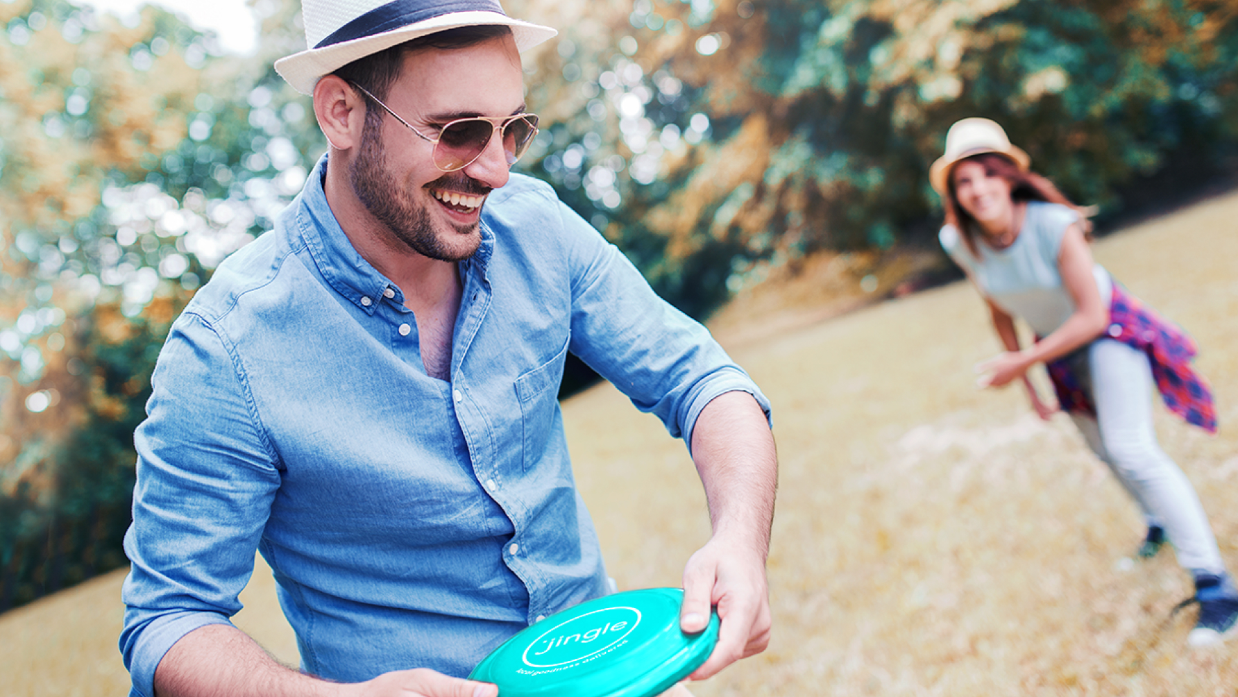
Jingle began as a tech-forward delivery app, engineered for efficiency. The vision was bigger: to create a joyful, nostalgic, and local experience that felt like the neighborhood ice cream truck had been reinvented for the digital age. The challenge was to transform a function-driven platform into a brand rooted in emotion, whimsy, and human connection.
Scope
Identity Refresh
Visual Design Toolkit
Brand Guidelines
360° Marketing Tactics
The Solution
Jingle is no ordinary delivery service.
Our first move was an identity refresh that infused the brand with delight and approachability. We crafted a vibrant, flexible visual language that celebrated spontaneity and nostalgia while remaining clean and modern for digital environments.
We built a robust visual design toolkit, from iconography to type styling, that allowed Jingle to maintain consistency across web, mobile, packaging, and marketing. The system was designed to scale with ease as the brand grew from pilot to rollout.
To support launch efforts, we created a 360° marketing strategy with touchpoints across digital, print, social, and outdoor. Our storytelling emphasized community, curiosity, and surprise, inviting users to rediscover joy at their doorstep.
Impact
A brand grounded in emotion and designed for growth, Jingle is a standout in the delivery space.
The refreshed Jingle brand transformed an app into an experience. Customers weren’t just receiving products, they were participating in a moment of delight.
The Exploration

The Work