The Packard Foundation
Objective
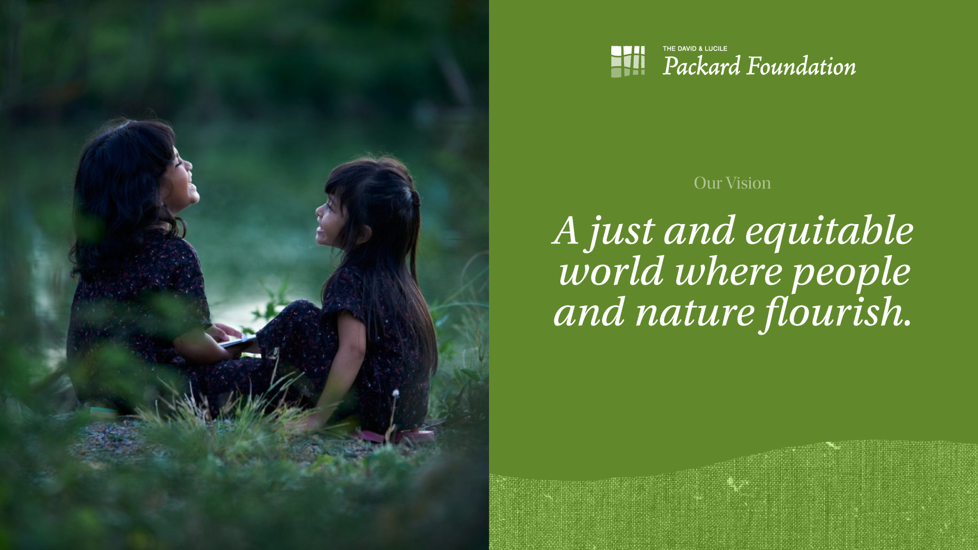
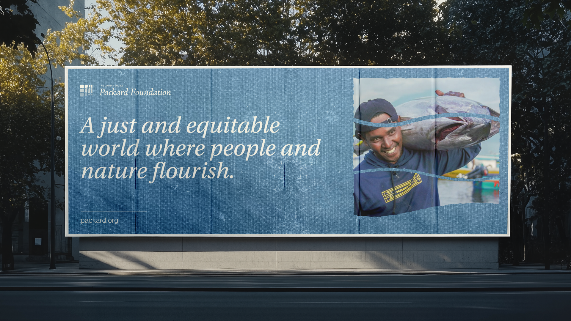
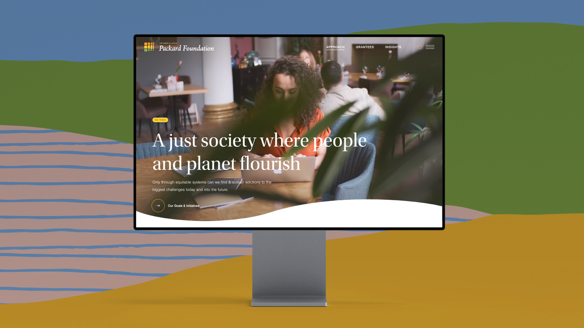
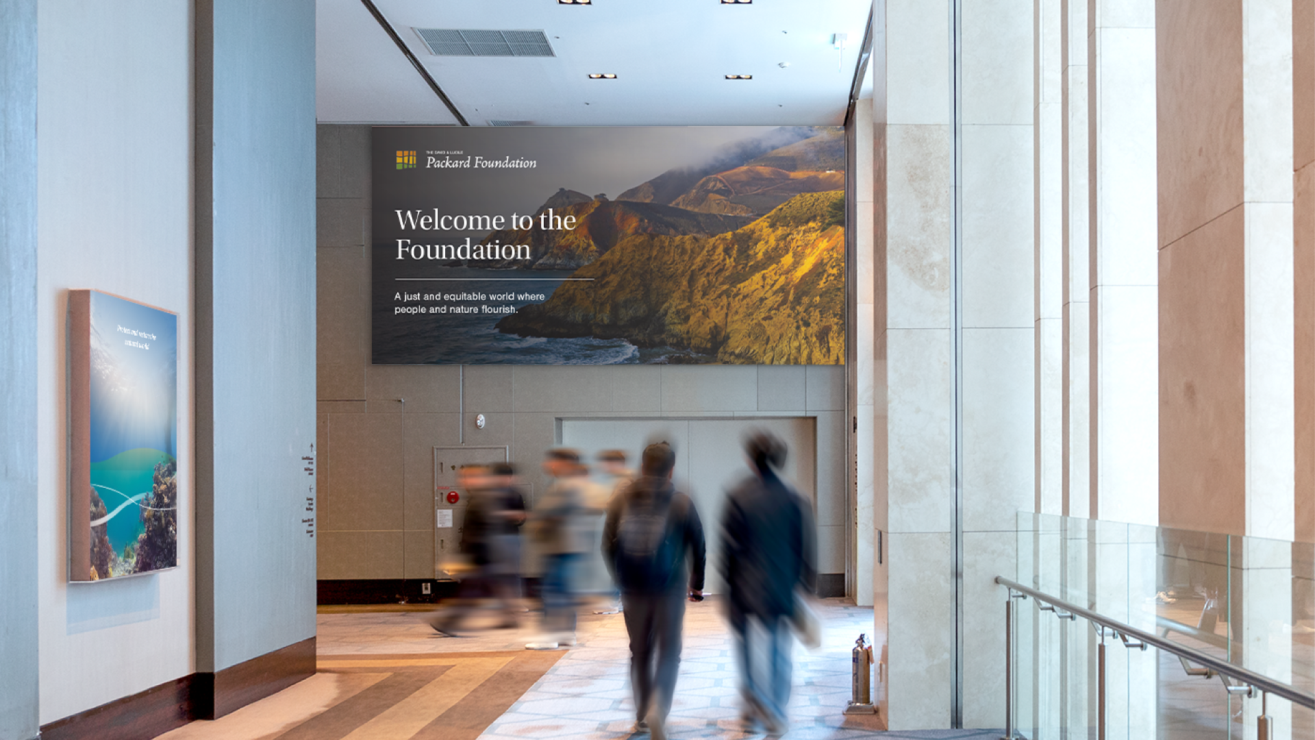
Since 1964, the David and Lucile Packard Foundation has been supporting philanthropic efforts in support of their vision for a just and equitable world where both people and nature flourish.
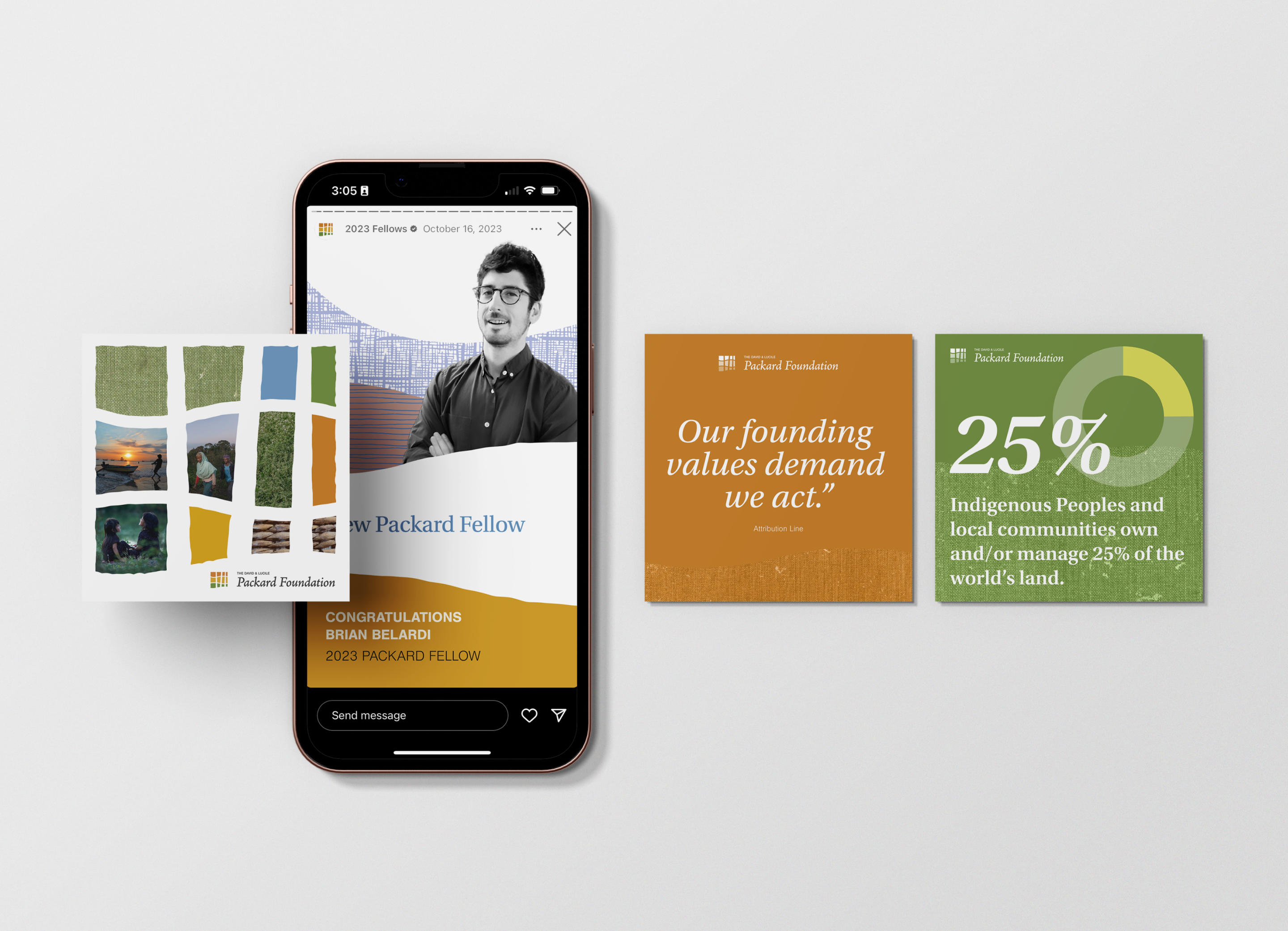
Barretto was selected to partner with key stakeholders and decision-makers in the development of a modernized logo mark, a new brand mark, proof of concept in the form of a design system, and the creation of identity guidelines.
Scope
Insight Gathering & Strategy
Stakeholder Consensus Building
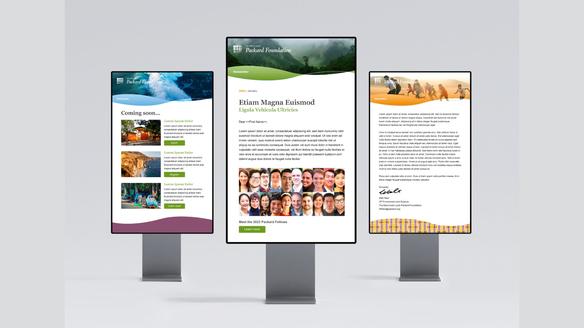
Visual Identity System & Toolkit
Identity Guidelines
The Solution
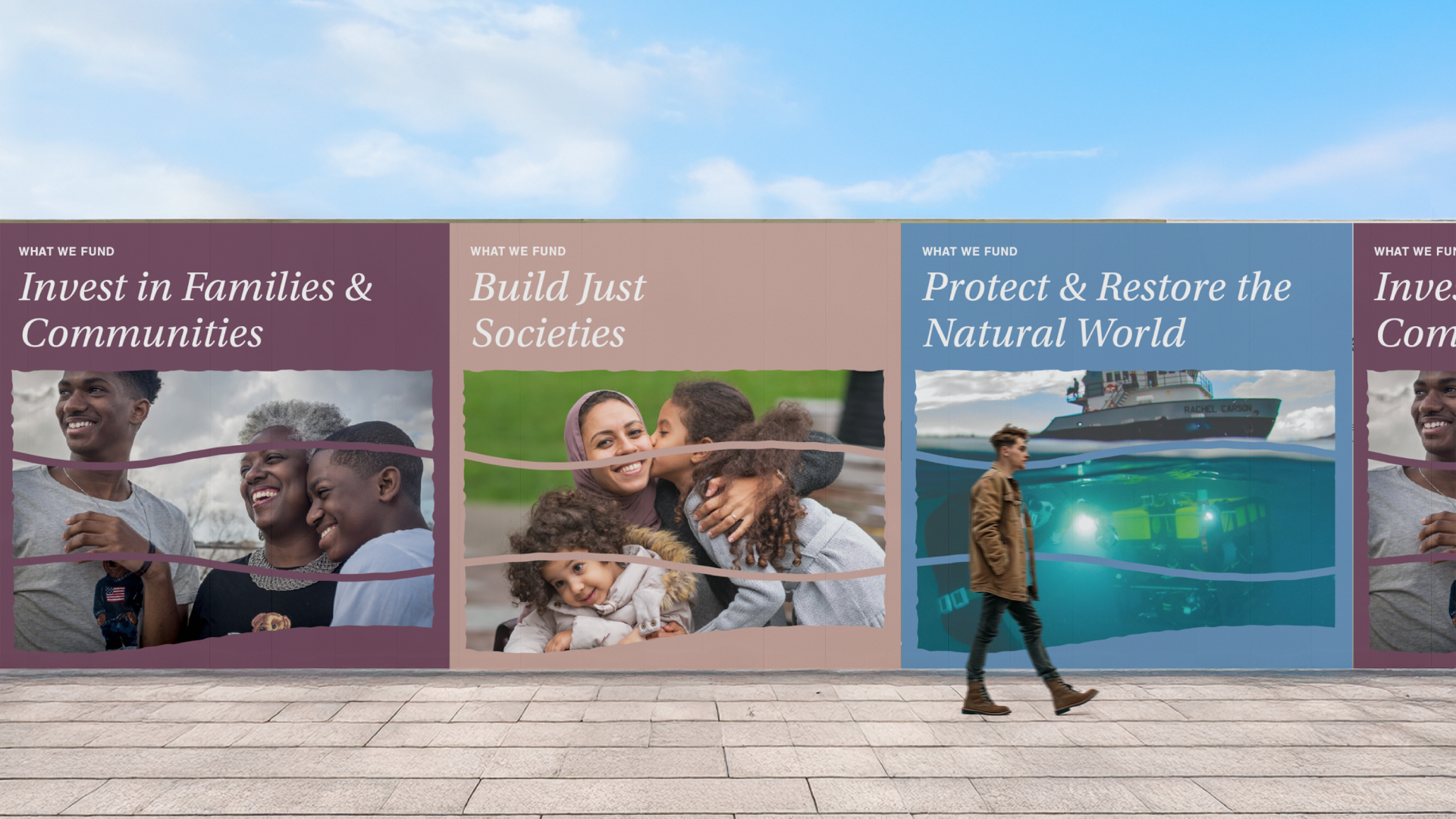
A visit to headquarters and the family home, now a grantee meeting space, revealed a carefully curated design aesthetic with deliberate intentionality. Inspired by both environments, we developed the concept of a “weave”—a metaphor for interconnected ideas and efforts.
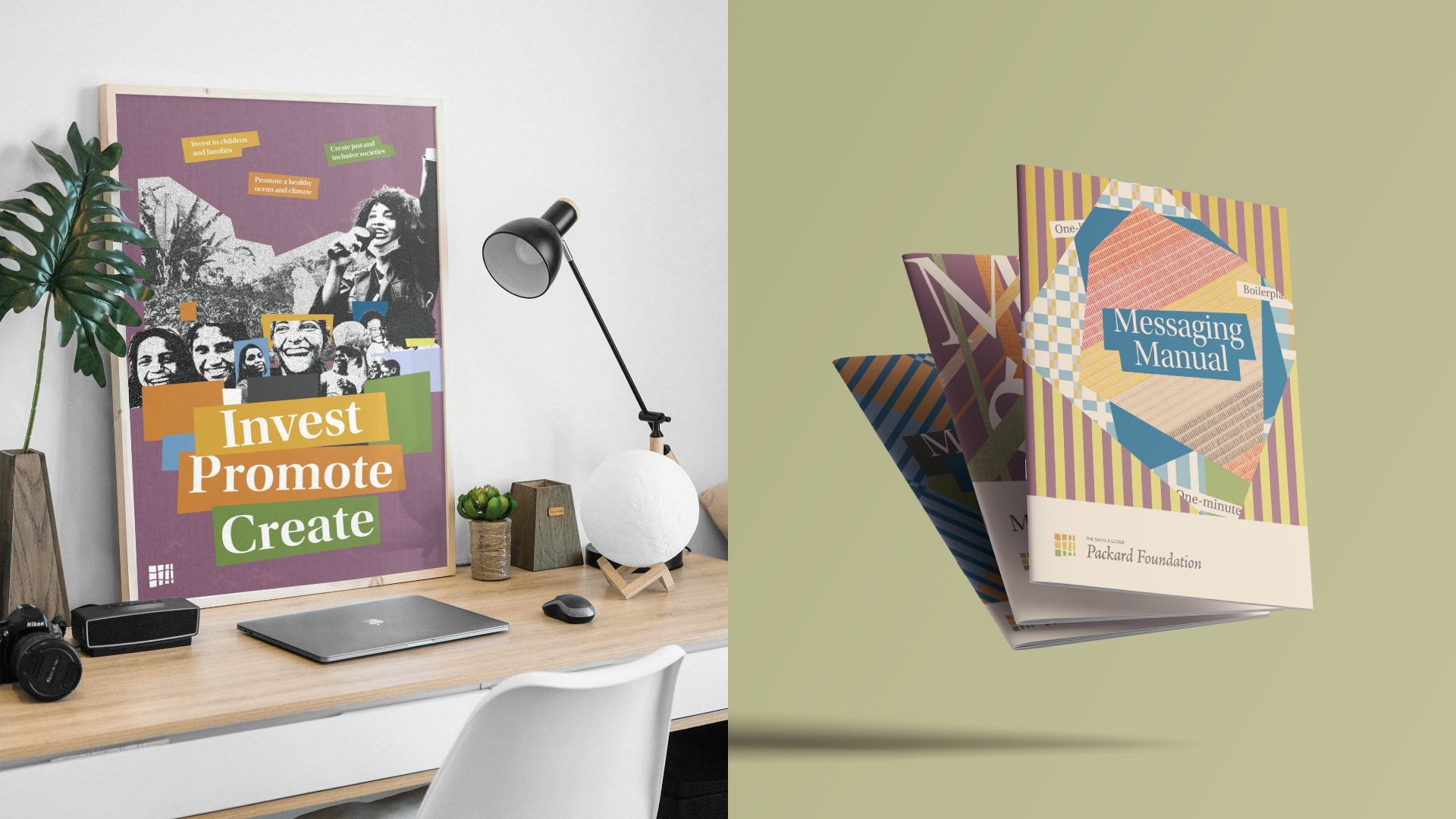
Our goal was to authentically represent the foundation’s DNA with a new, refreshed public image. The following overarching themes guided our efforts and design decisions: people/nature; harmony; joy/optimism; West Coast ethos; everlasting; between where we are now and net-new; great design: make it artful; nature is beautiful; and lastly, it must be legible.
The Currency
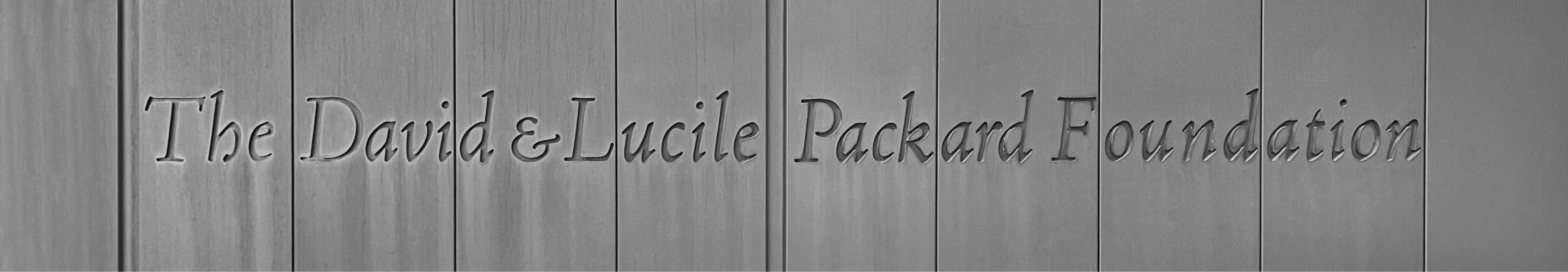
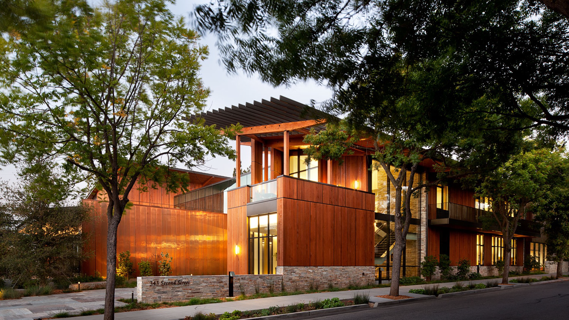
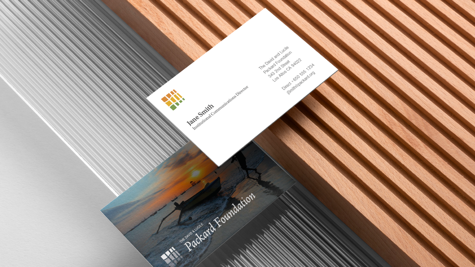
The entryway of the LEED-Certified headquarters in Los Altos, CA, is etched with immutable exterior typography in the font face Jensen—an Old-Style serif typeface. We explored dozens of alternate typefaces from historic to modern, ultimately making the recommendation to retain and leverage Jensen as the solution, remaining consistent with the architectural signage with a minor adjustment to the letter “k” to improve readability at small sizes.

The Big Idea
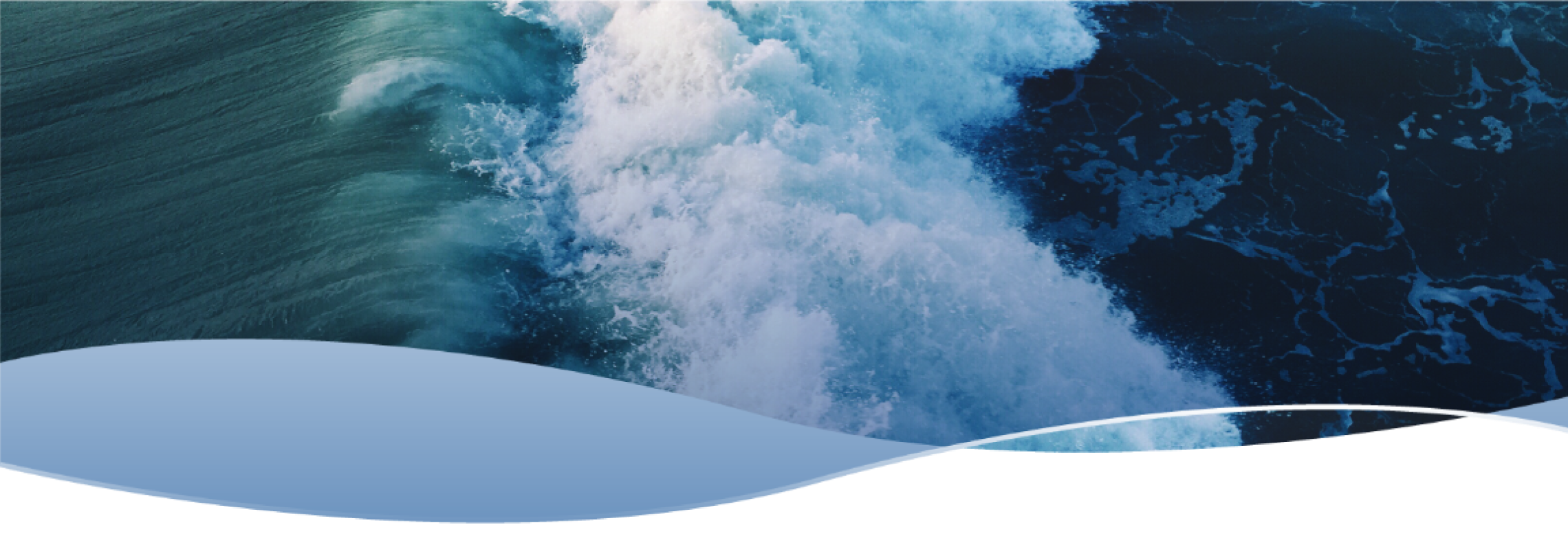
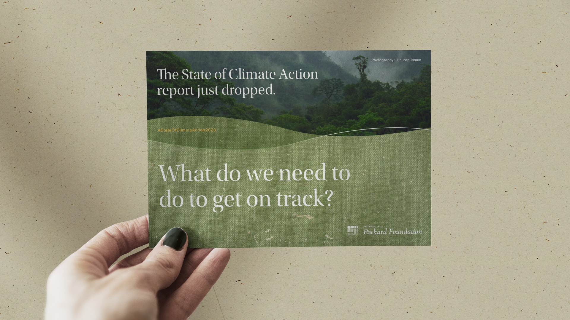
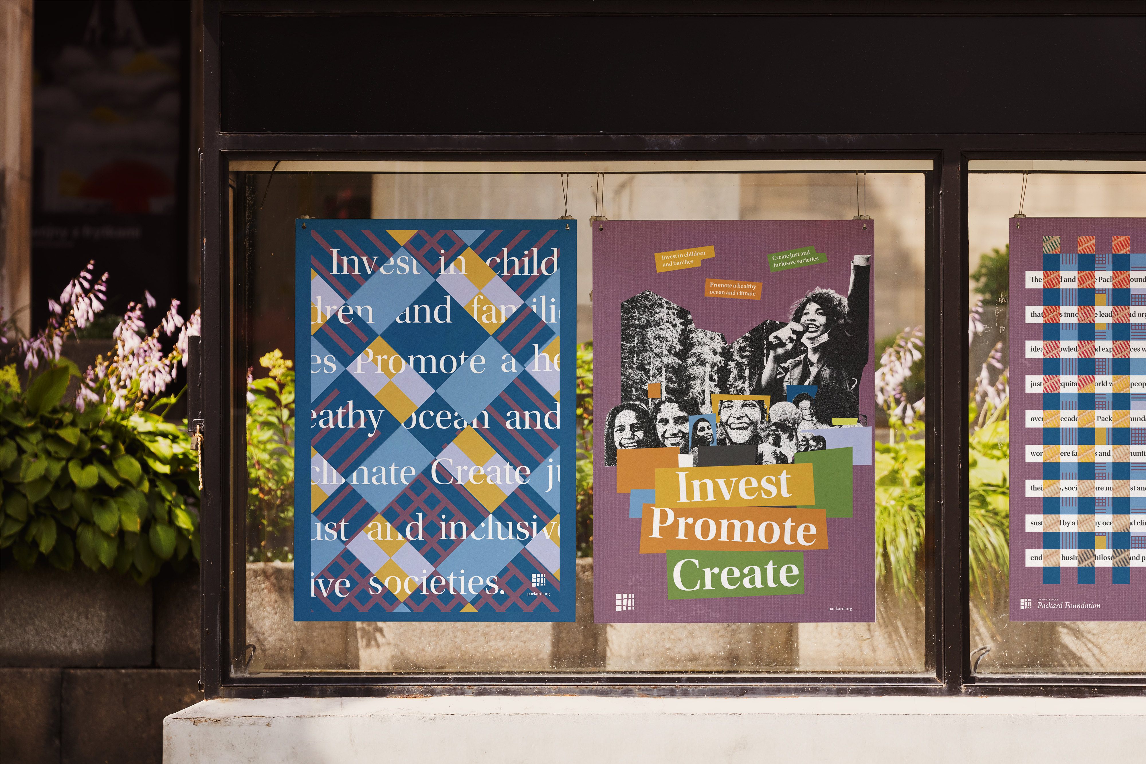
Exploring “interwoven” as our concept, our studies included forest tree trunks interlaced with ocean waves. Each distinct, intricately intertwined strand enhances the resilience, longevity, beauty, and solidity of the outcome—the fabric.
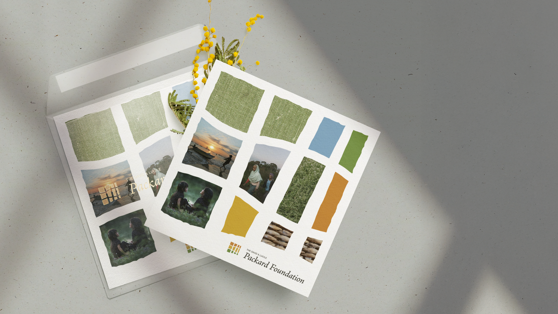
Woven fabrics are an expression of a community’s history, values, traditions, and identity—rich in symbolism, colors, and unique motifs—they foster a curiosity, understanding, and appreciation for the diversity of all people and their cultures.

The Studies

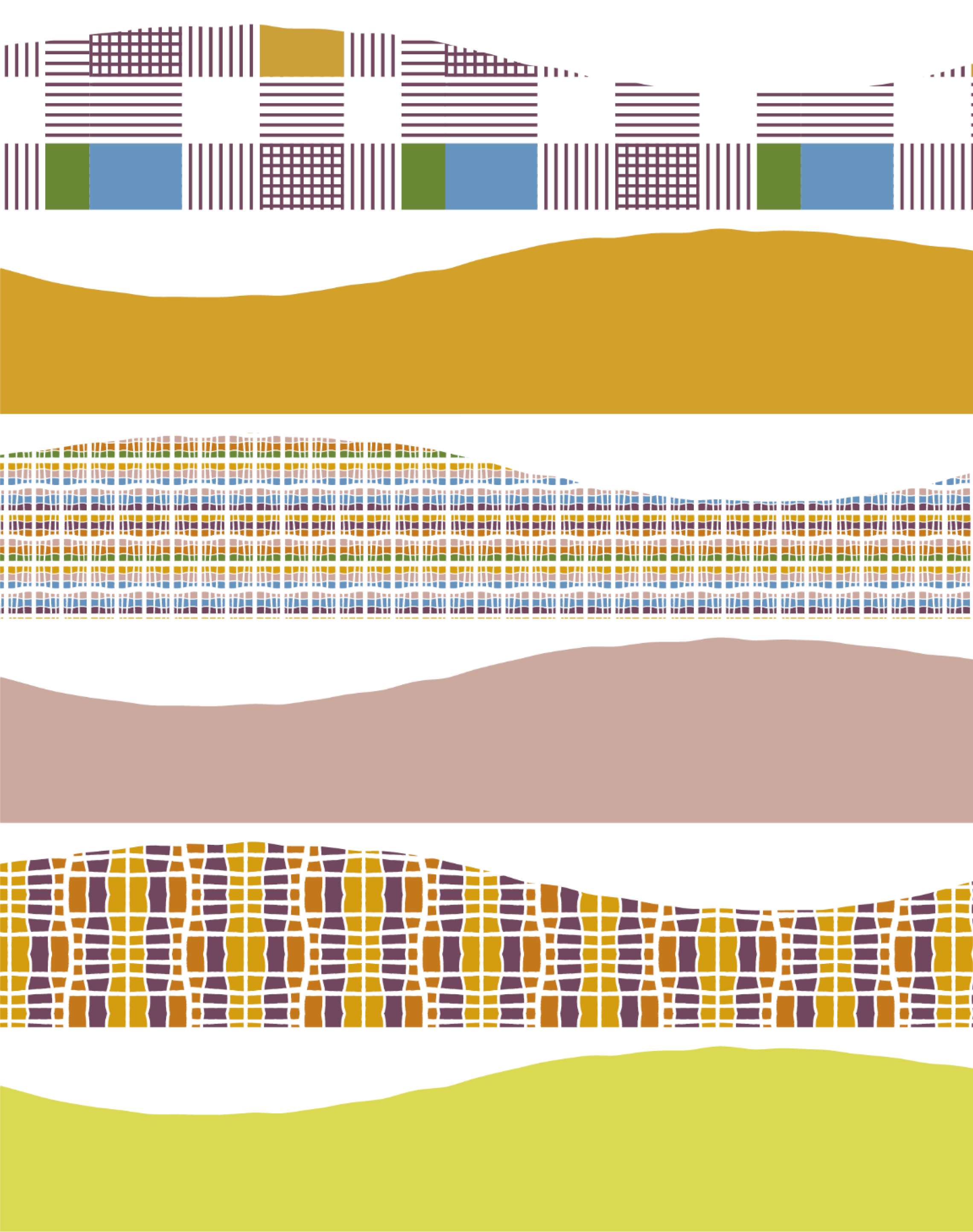
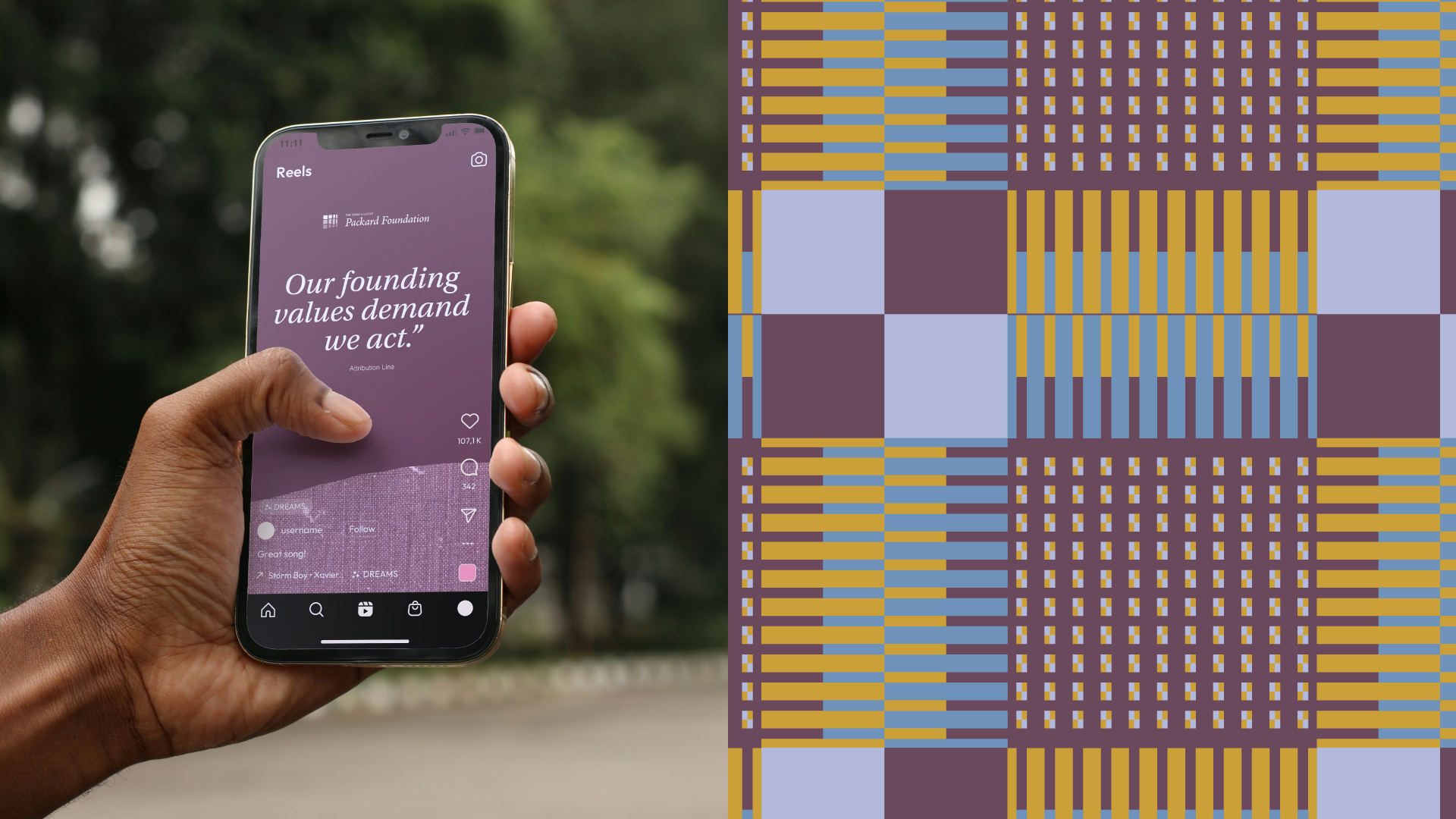
The Weave-Wave
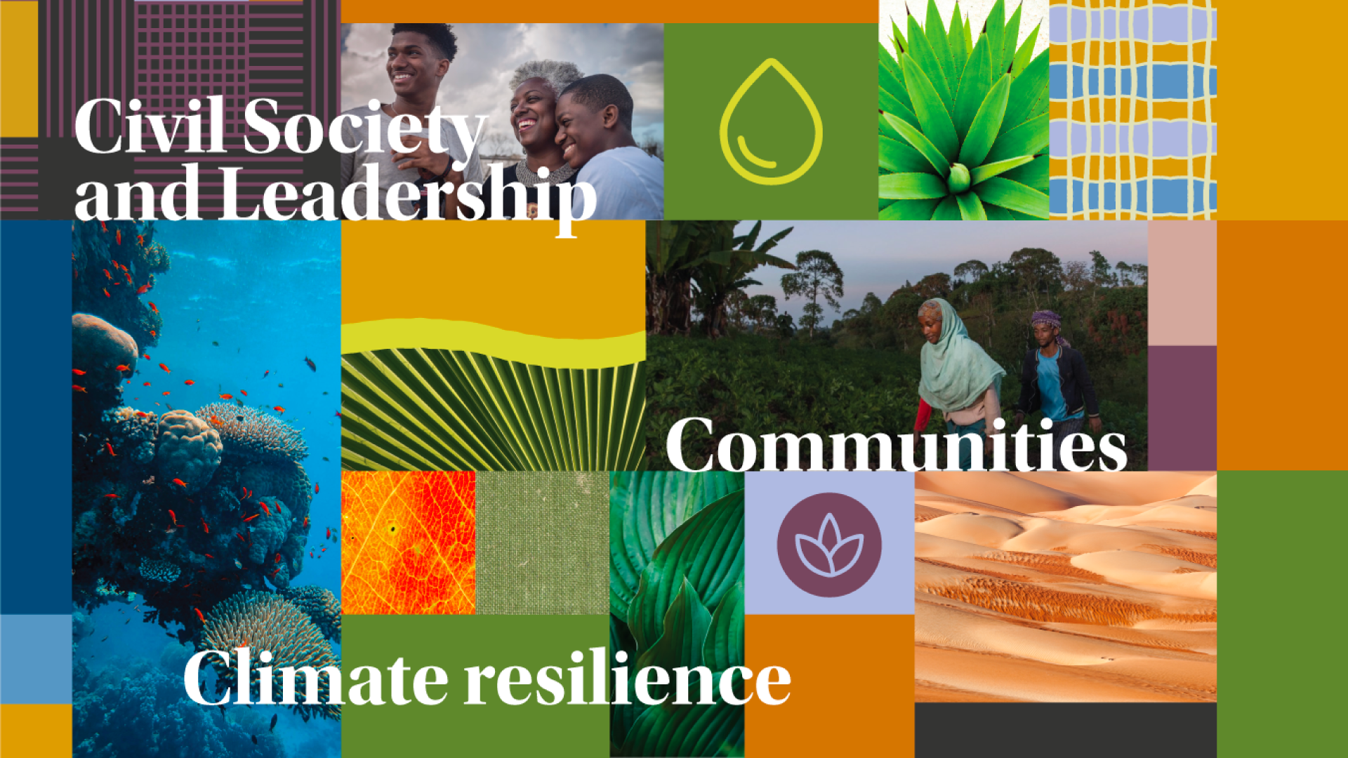
With proprietary colors named after nature’s palette, dynamic and interwoven patterns, and a curvilinear shape we termed the “weave-wave”, we embarked upon a graphic exploration of just how far we could push the visual language.
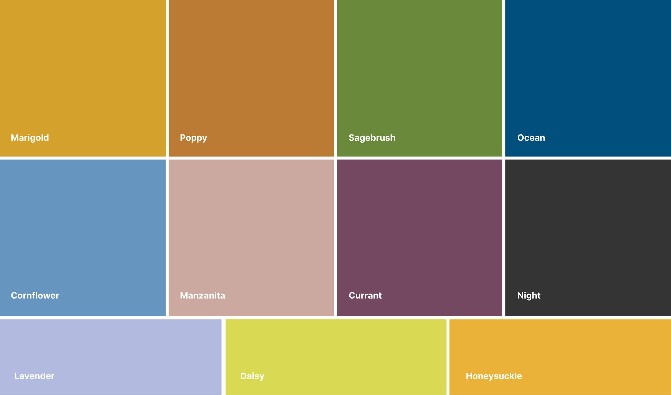
The Color Palette
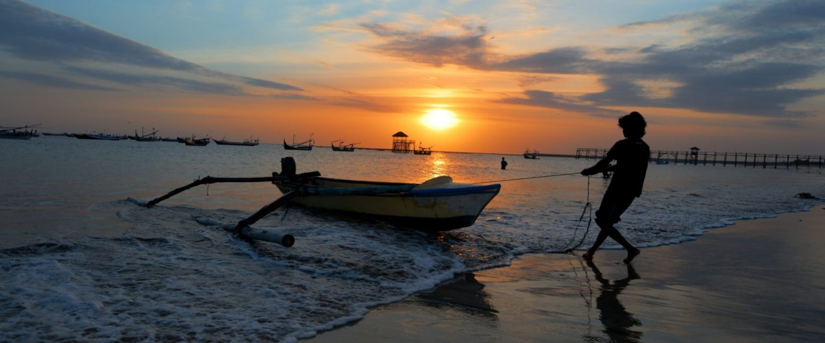
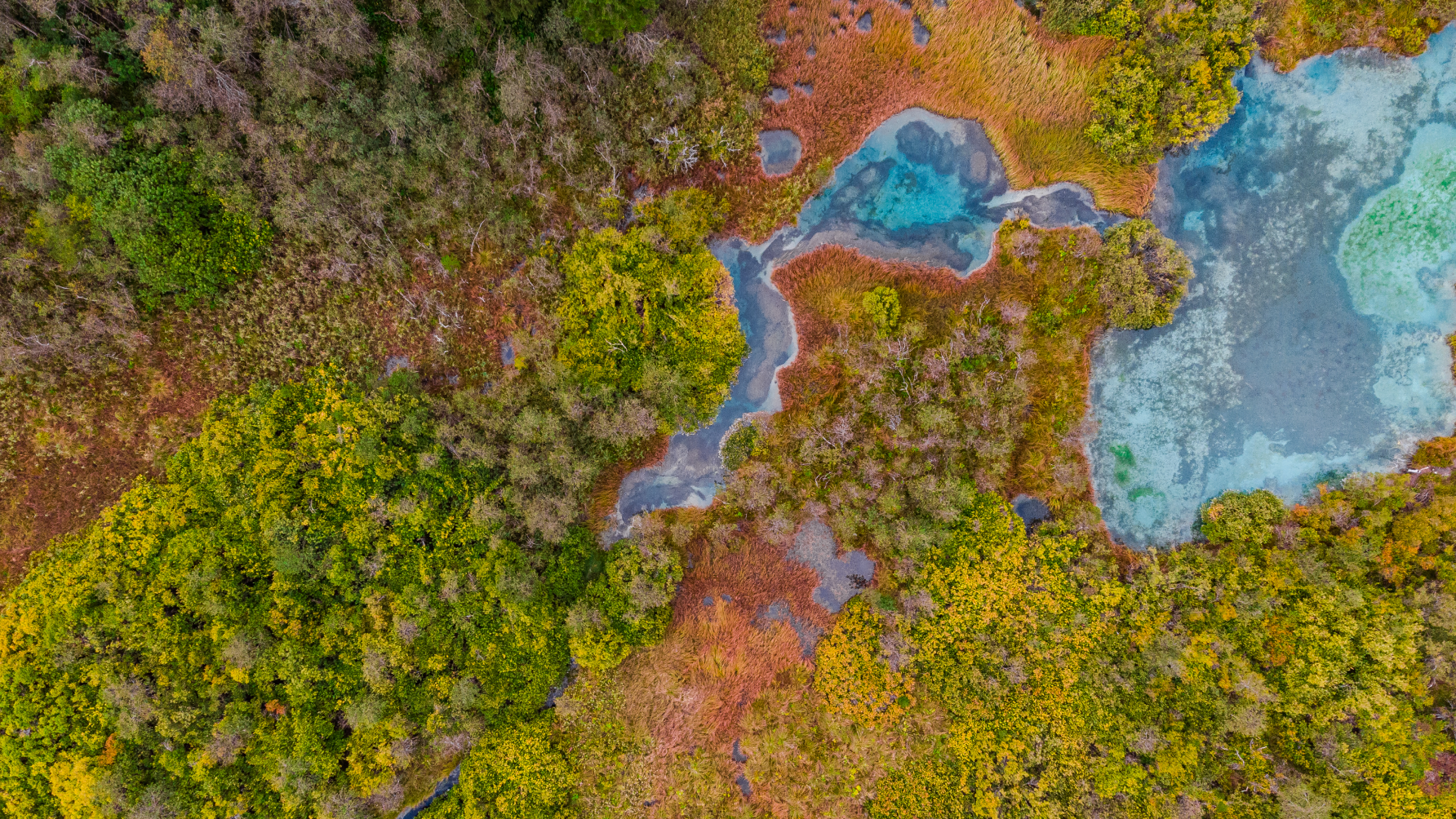
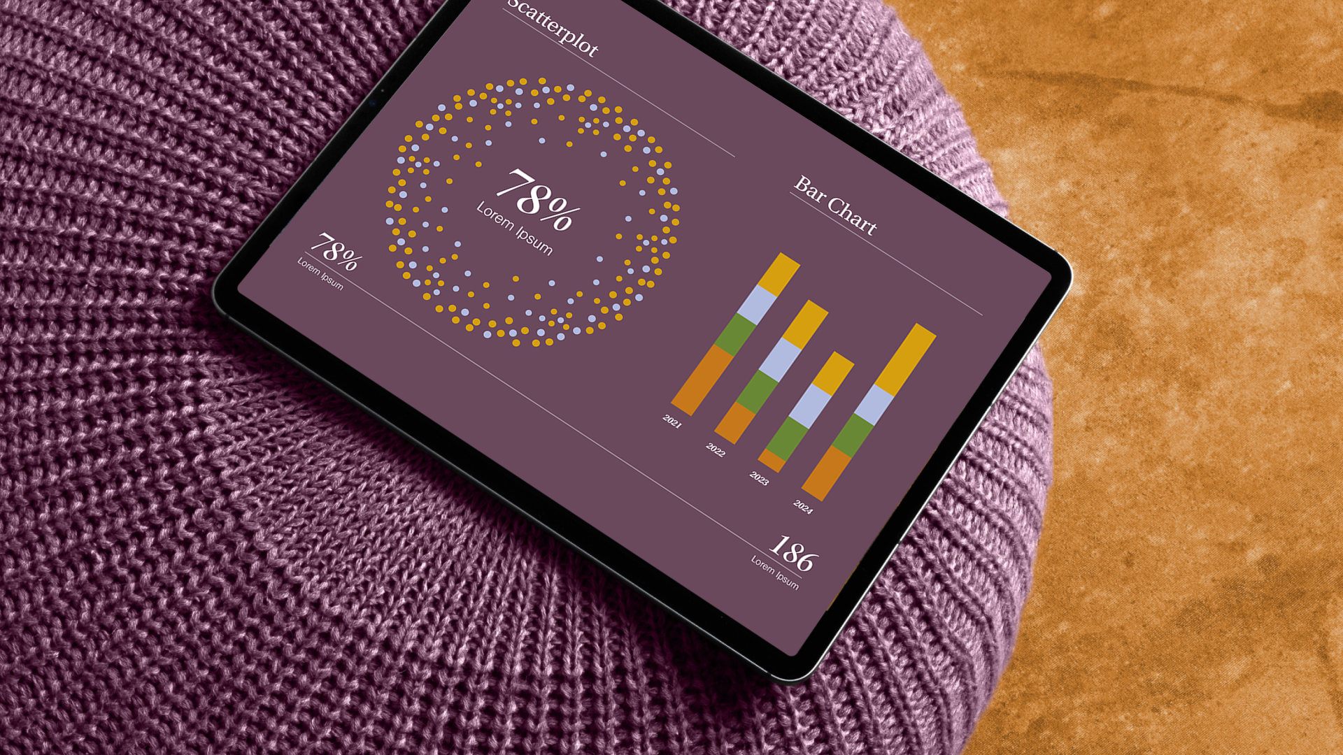
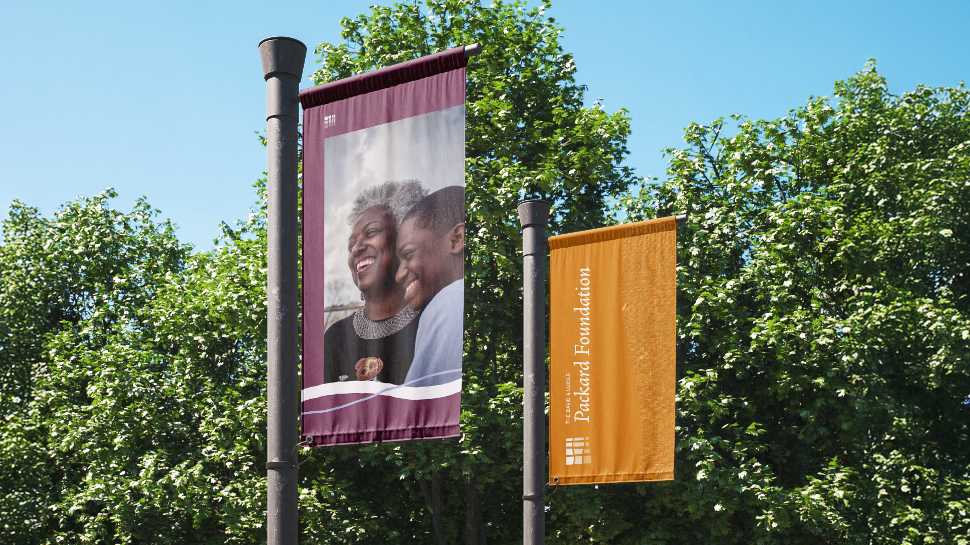
Selecting colors can have an impact beyond aesthetics; it’s a language that communicates values, emotions, and personality. Colors evoke specific feelings and perceptions, influencing how people relate to and remember an organization’s identity. The new Packard Foundation color palette seeks to communicate harmony, joy, optimism, and a uniquely West Coast ethos. To inform our palette, we looked to California’s natural beauty found at Point Reyes, the coastal Highway 1, Yosemite National Park, and Lake Tahoe. Mother Nature’s palette allowed us to introduce a new color approach for the foundation.
The Typography


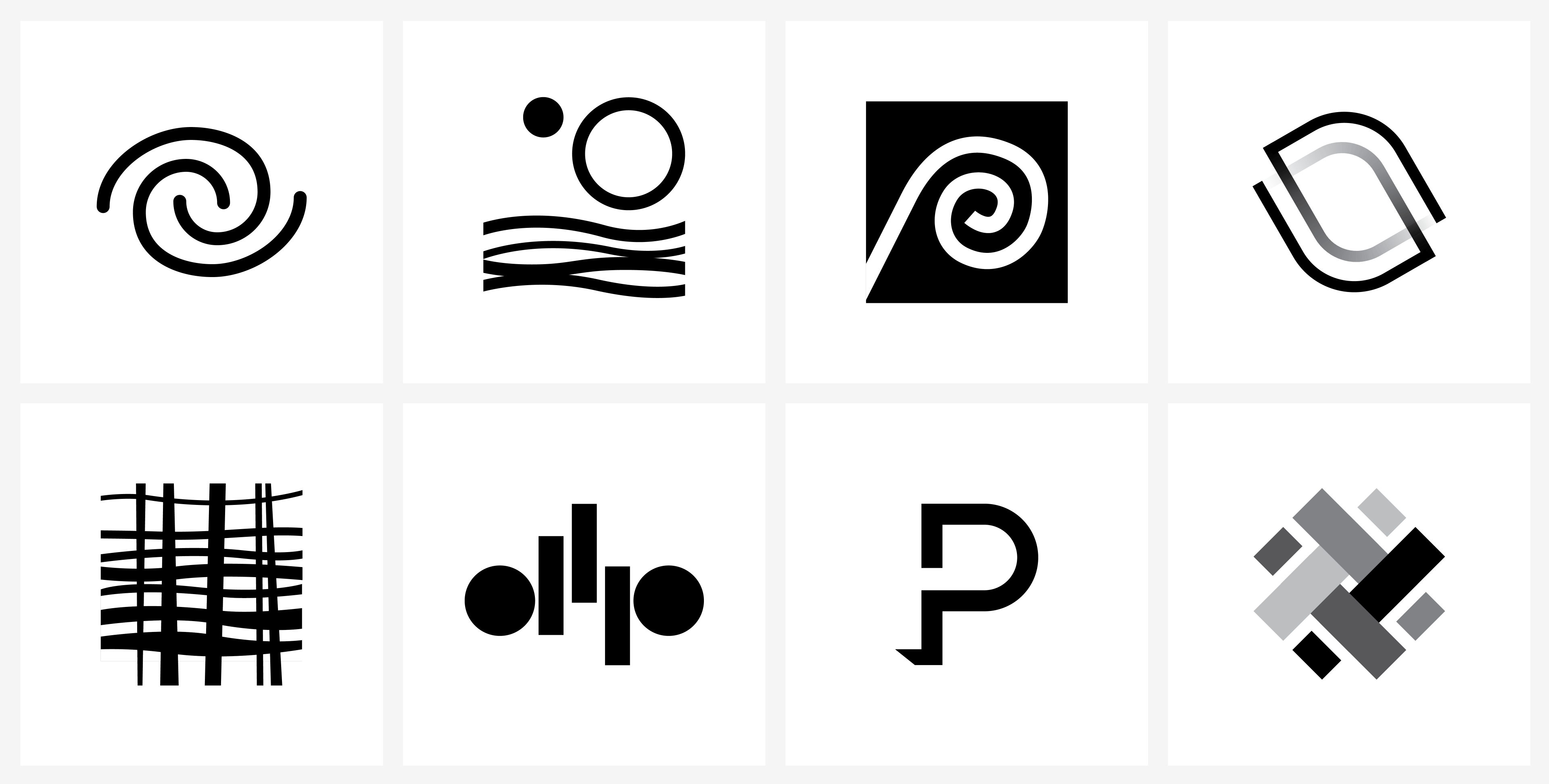
The Cutting Room Floor
The journey is the reward—a valid adage for this collaborative initiative with The David and Lucile Packard Foundation. Barretto had proposed twenty-four logos in our first round presentation. Additionally, we executed six animated identity options for inclusion in our second round to illustrate the power of motion in storytelling. We rigorously polish and present our ideas with high fidelity in order to reach a consensus with significant and discriminating stakeholder groups.