
UCSC Arts Division
Objective
To guide the UC Santa Cruz Arts Division through a brand and website refresh, Barretto-Co. Conducted discovery sessions with department representatives and key stakeholders. These sessions were designed to surface current challenges, align on objectives, and define the needs of primary audiences. Topics covered included: visual direction, tone and feel, site navigation, marketing goals, required functionality, and analytics, culminating in a comprehensive creative brief.
Scope
Visual Identity
Consensus Building
Information Architecture & User Experience
Brand Guidelines
Website Design
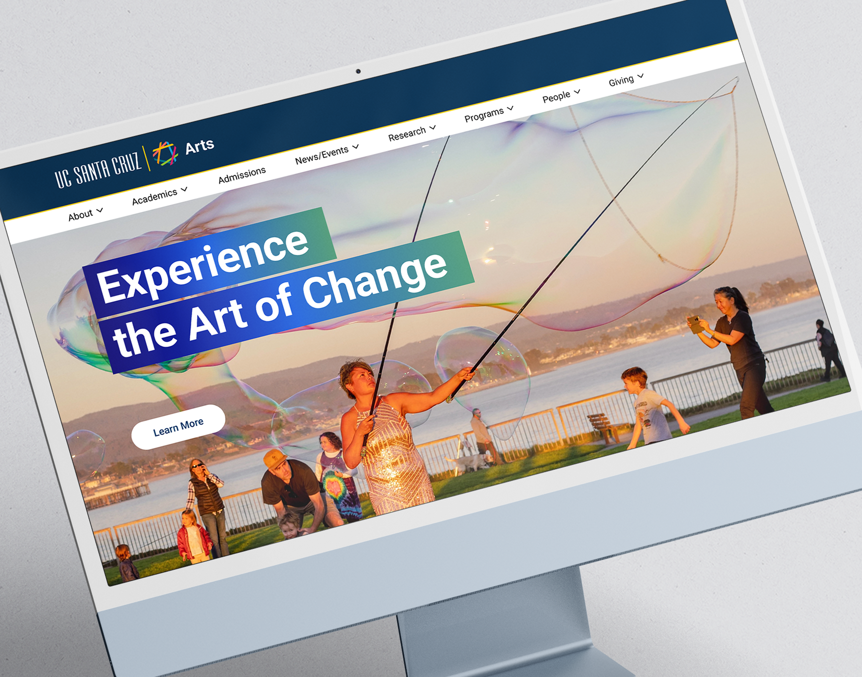
The Solution
Our goal: to develop a system that resonated with the arts community, upheld the university’s values, and improved the user experience for a diverse audience.
With the arrival of Dean Celine Parreñas Shimizu, the first woman of color to lead the division, UCSC Arts embarked on a bold new chapter. Barretto-Co. was tasked with creating a visual identity that could reflect this cultural and institutional milestone.
We delivered a refreshed visual identity tailored specifically for the new website, supported by formal brand guidelines. This identity informed all aspects of the site design, including updated typography, color palette, and layout. The result was a visual language that reflects the division’s DNA, creative, inclusive, and forward-looking.
Impact
The redesigned website addressed user needs more effectively, attracted new interest, and strengthened engagement.
It positioned UCSC Arts as a vibrant, contemporary division within the university, while also honoring its legacy of artistic and academic excellence.


The Concepts

The Typography

The Palette

The Work


The Website