For me personally, this was the visual identity project of a lifetime.
I have always maintained that identity design is the most difficult (and most rewarding) challenge for a designer. Why? Because the personality, or identity, of an organization is multifaceted and complex. A designer must be curious, rigorous, and wide-eyed, absorbing everything like a sponge. When immersion and discovery are properly conducted, it includes stakeholder interviews, immersion into industries and audiences, unpacking client information, and the inclusion and consideration of all subjective opinions and viewpoints before putting pencil to paper.
In addition, one must also be a mirror, reflecting back the learned perceptions to the client and turning insights into creative inspiration. Ultimately, every logo should tell a story: one that stakeholders widely agree upon and are proud to tell and capture the organization’s values and DNA in such a way that it is unmistakable and unmissable to the audience.
Our Story Begins (with theirs)
The David and Lucile Packard Foundation is situated in the southwestern hills of the Bay Area, a region once inhabited by the Ohlone people. This land has provided abundant resources to build and sustain vibrant communities for over ten thousand years. It is no coincidence that David and Lucile chose this location as well; to attend university; to volunteer helping those in need, to start a family, and to grow a business. With a legacy of accomplishments—and a shared desire to give back to the community at large—they created a foundation that, through its interwoven and interconnected commitments to people and nature, has supported equitable outcomes for both to flourish.
The following overarching themes guided our efforts and design decisions: people/nature; harmony; joy/optimism; West Coast ethos; low-key family; everlasting; between where we are now and net-new; great design/artful; nature is beautiful; immutable architectural exterior typography; and lastly, it must be legible.
An Inspirational House Call
A visit to the foundation’s offices and also to the Packard family home revealed a carefully curated design aesthetic with deliberate intentionality unique to the family and present to this day. Inspired by the environs, we developed the concept of a “weave”, our solution is a metaphor for interconnected ideas and efforts.
“I found I could say things with color and shapes that I couldn’t say any other way—things I had no words for.” – Georgia O’Keeffe
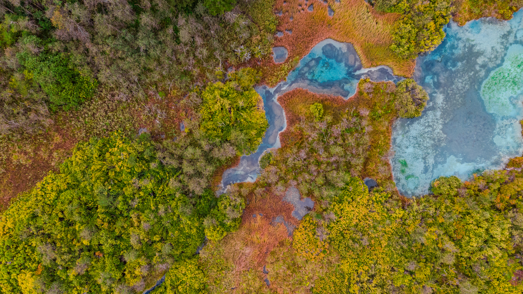
Colorful California
Selecting colors can have an impact beyond aesthetics; it’s a language that communicates values, emotions, and personality. Colors evoke specific feelings and perceptions, influencing how people relate to and remember an organization’s identity. The new Packard Foundation color palette seeks to communicate harmony, joy, optimism, and a uniquely West Coast ethos. We looked to California’s natural beauty found at Point Reyes, the coastal Highway 1, Yosemite National Park, and Lake Tahoe to inform our palette. Mother Nature’s palette provided us with an opportunity to introduce a new color approach for the foundation.
Weave, Fabric, and Texture
Exploring “interwoven” as a cue, we were inspired by the concept of a “weave”—a metaphor for interconnected ideas and efforts. Each distinct, intricately intertwined strand enhances the resilience, longevity, beauty, and solidity of the outcome—the fabric. Woven fabrics are an expression of a community’s history, values, traditions, and identity—rich in symbolism, colors, and unique motifs—they foster a curiosity, understanding, and appreciation for the diversity of all people and their cultures.
About Barretto
Our track record for identity work spans three decades. It includes notable companies and organizations such as Apple, Autodesk, SFMOMA, Sonic, Stanford Healthcare, TinyPrints, VeriSign/Symantec, UC Santa Cruz, and Whole Foods.
We’re honored to add The David and Lucile Packard Foundation identity to our list of accomplishments. The final work represents an intimate client-agency collaboration, was unanimously board-approved, and is unlike any other visual identity in the philanthropic landscape. In some ways, we’ve been training for this assignment our entire careers, and we are grateful to have been involved, as well as to all those who participated.