Barretto Announces B-Corp Certification

A modern graphic with a light gray background and bold black text that reads, “Design with purpose.” The word "purpose" is underlined with a horizontal gradient bar transitioning from mustard yellow to teal, then to maroon and bright red. On the lower right side of the image is the Certified B Corporation logo in black, indicating social and environmental business accountability.

B Corporations™, are companies throughout the world that meet high standards of social and environmental performance, accountability, and transparency. Barretto is now part of a global community of businesses working collectively for economic systems change, and in order to stay committed to this work, we are required to meet rising standards for social and environmental … Read more
Avail Raises $100M > Barretto Boosts Brand

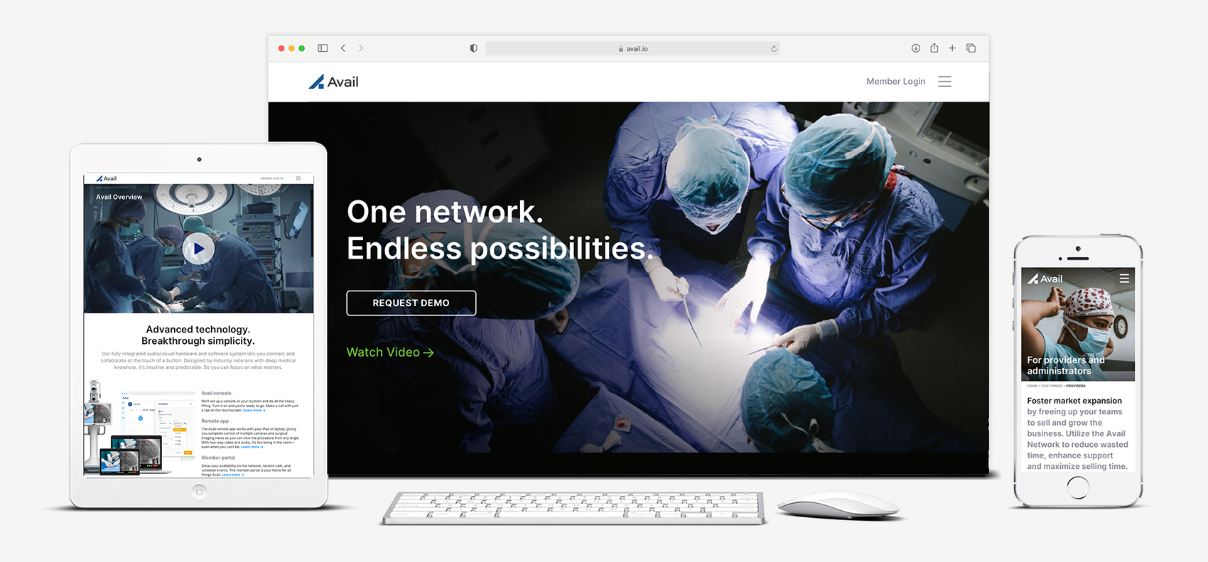
A clean, modern promotional image showcasing the Avail platform on multiple devices: a tablet, desktop, and smartphone. The central desktop screen displays a surgical scene with the text “One network. Endless possibilities.” and a “Request Demo” button. The tablet to the left shows an Avail overview video and supporting product information. The smartphone on the right displays a healthcare professional in scrubs with text directed toward providers and administrators. The overall theme emphasizes advanced audiovisual technology for remote medical collaboration.

“Barretto-Co. is a partner through and through…” “Barretto-Co. is a partner through and through. They are proactive, they take the time to understand our business, and care immensely about our success—which means they deliver thoughtful and impactful results. Their team has brought forth creative and strategic ideas that have really helped us develop a brand … Read more

Reflecting on Year 2020

A black background with bold, white, all-caps text centered in the image that reads “BLACK LIVES MATTER.”

As we continue to move forward Looking back on 2020 as we near the year-end, it’s hard not to feel a flood of mixed emotions. This year has been fraught: fraught with challenges. With pain. With disappointment. With division. But through the tumult and the struggle, there’s also been reason to hope and to look … Read more

How to Be A Courageous Brand

A dramatic still of the Cowardly Lion from the classic film The Wizard of Oz, wearing a green crown and a surprised or expressive facial expression, with the bold white text "Courage" overlaid prominently across the center of the image.

There’s no hard or fast rule that says a brand has to be loud about its values… or even that it has to communicate values openly to its consumers. While most marketers tend to agree that having a few core brand values that are clearly-identified and well-articulated for audiences helps those followers establish a deeper … Read more

Jamming. It’s Our Jam.

A top-down view of an assortment of freshly baked hamantaschen pastries arranged on a parchment-lined baking tray. Each triangular pastry features a different fruit or poppy seed filling in the center, such as apricot, cherry, apple, and prune, with golden-brown crimped edges.

How do you conduct a brand identity and website refresh for one of the oldest, iconic bakeries in San Francisco? With as much passion as the bakers themselves have for their craft. …and with food photography that tickles your taste buds. The Cinderella Bakery on Balboa Avenue in San Francisco is a community cornerstone with … Read more

A Lesson for Young Creatives…

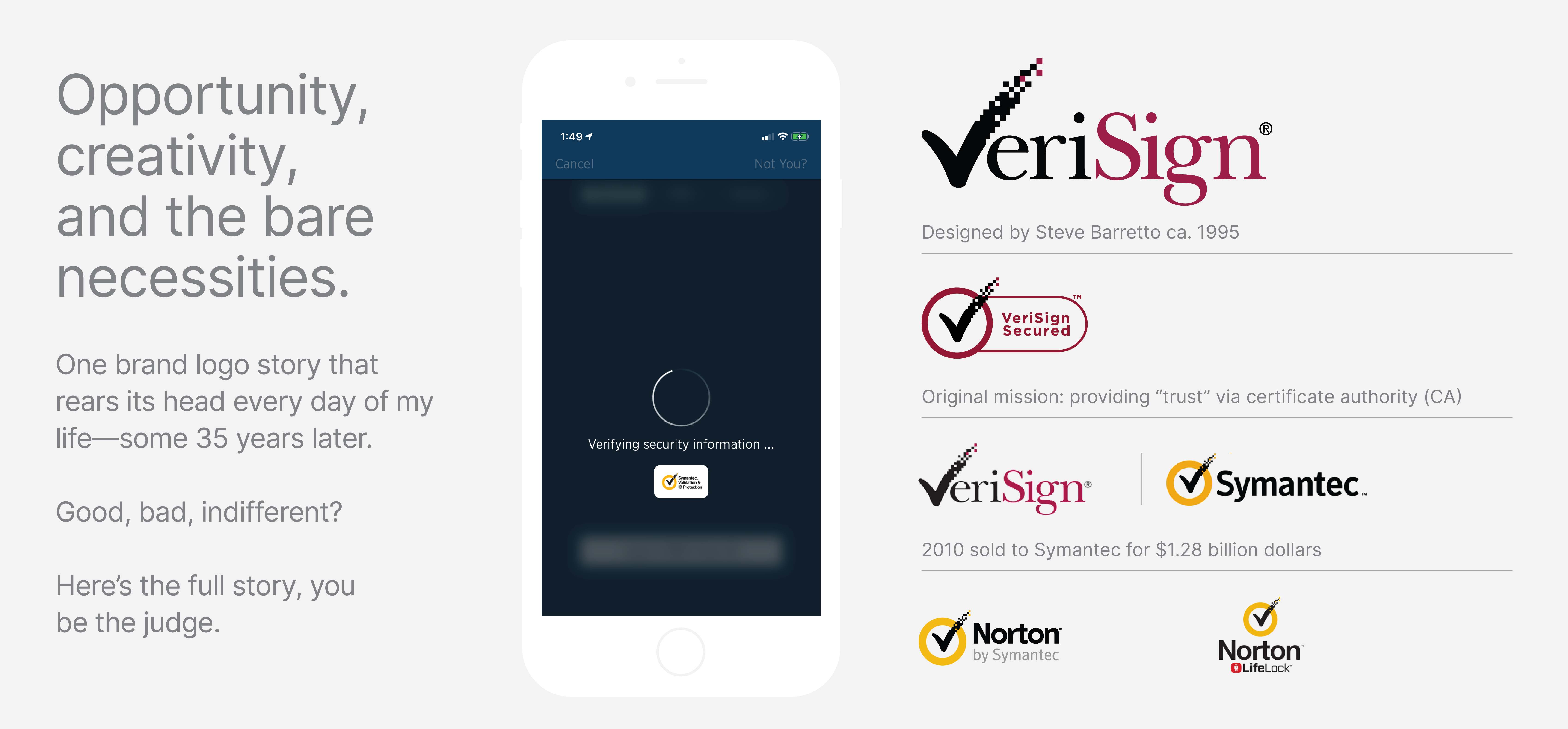
A graphic sharing the history of the VeriSign logo, designed by Steve Barretto around 1995. On the left, gray text reads: “Opportunity, creativity, and the bare necessities. One brand logo story that rears its head every day of my life—some 35 years later. Good, bad, indifferent? Here’s the full story, you be the judge.” Centered is a smartphone screen showing a security verification with the Symantec logo. On the right, there are versions of the VeriSign logo including "VeriSign Secured," the original VeriSign logo, and the Symantec and Norton brands that succeeded it after VeriSign was sold to Symantec for $1.28 billion in 2010.

Every time I check my bank balance or make a financial transaction on my mobile phone, tablet, laptop, or desktop, I’m reminded of a brand identity solution I created for VeriSign in the mid-1990s for the sum of ~$3,000.00. Fifteen years later, Symantec would acquire Verisign’s authentication business to the tune of $1.28 billion in … Read more

Building A Brand: 3 Key Learnings

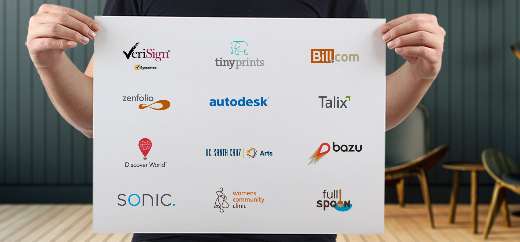
A person holds a white poster board featuring a grid of various company and organization logos. These include VeriSign, TinyPrints, Bill.com, Zenfolio, Autodesk, Talix, Discover World, UC Santa Cruz Arts, Bazu, Sonic, Women’s Community Clinic, and Full Spoon. Each logo is distinct in color and style, representing diverse industries from technology and finance to healthcare and education. The background setting is a modern room with wooden floors and mid-century chairs, blurred out to focus attention on the logos.

I’ve been designing and stewarding brands with for-profit companies and nonprofit organizations since leaving Apple in the early 1990’s. If you use the internet, you’ve likely come across some of the work; Symantec (formerly VeriSign), TinyPrints (acquired by Shutterfly), Zenfolio (acquired by Art.com), Bill.com, Sonic.com, eBay Bucks, Whole Foods and others). It has taken me … Read more